Word on a Whim
Archive for the category “Art”
The Lighthouse Tarot
My latest project, “The Lighthouse Tarot” is ready to go to print.
I had intended to print the cards myself but when I used a whole ink cartridge to print a single deck, I decided it would be cost effective to have a small print-run done next year.
Here is taster of the seventy-eight card deck – followed by some blurb.
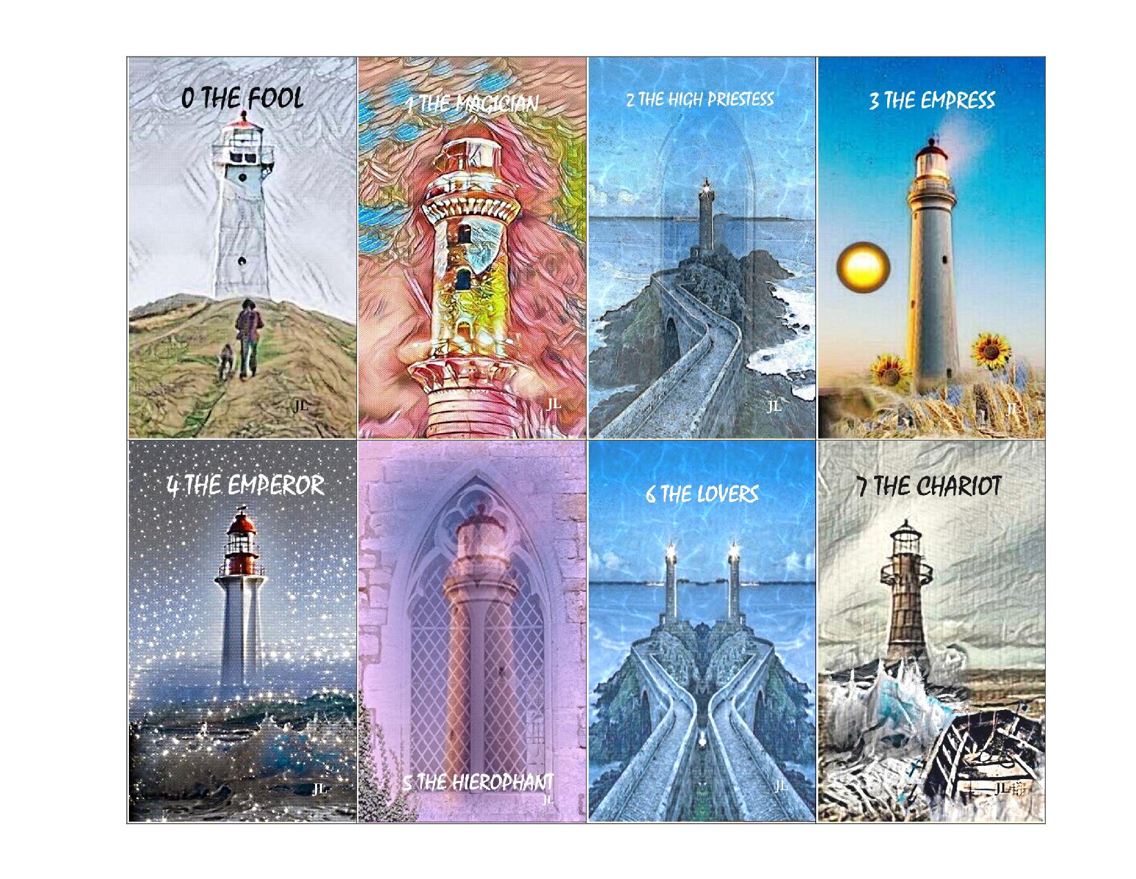

My love of lighthouses started at an early age in Withernsea on the North East Coast of England. My auntie had a holiday chalet and we went every year. I remember that first night I noticed the huge spotlight sweeping rhythmically across the beach and reaching out to sea … eerie and compelling.
“It’s a lighthouse,” they told me. “It protects the ships and keeps them safe by warning them of rocks and other hazards along the way.”
I was drawn to seek the source of this benevolent beam and it was some surprise to find it was on an ordinary residential street with houses either side – in reality far removed from the romantic images evoked when it came to life each night – although I still gazed in awe at its solid, reassuring mass. I must have been about twelve when it was decommissioned and the seascape at night lost an important part of its magic.
As my interest in art developed, seascapes with lighthouses became a favourite theme – not just the reaching out across the sky and reflecting on the water but also the strength of these imposing structures that could withstand a battering from nature at its most unforgiving. When I decided to design tarot cards, “The Lighthouse Tarot” was a natural choice. Just as the lighthouse provides a guiding light to help sailors avoid the rocks along the way, these cards aim to unlock the reader’s insight into past present and future events in the questioner’s life and provide support in this life’s journey. Always bear in mind that we have free will, so if the reader suggests that your destiny is not what you were hoping for, you can make choices that will alter the course of events. The ship’s wheel is in your hands and you are empowered to navigate your own path.
How to convert an image to 300 DPI for printing (using Microsoft Paint)
Being furloughed and locked-down owing to the pandemic has given me the time to get stuck into a project I have been toying with for a few months. Yes, I do feel guilty that I am slightly enjoying this very difficult situation yet I am trying to make the best of it because this is where we are now. I don’t want to jinx my project by saying too much about it here – but if it does come to fruition it will require me to convert images to 300 dpi to allow better quality printing. Before getting on with this tutorial, I will also add that the printed images I would be required to convert to 300 dpi are relatively small, and when I experimented on my cheap little home printer by printing a 72 dpi image alongside the same image converted to 300 dpi I could not see any difference, so if I end up self-publishing my images I will leave them at 72 dpi to save ink. It’s just that some publishing firms stipulate a 300 dpi image.
Here goes …
First you need a 300 dpi image of any shape or size. Feel free to download this one:
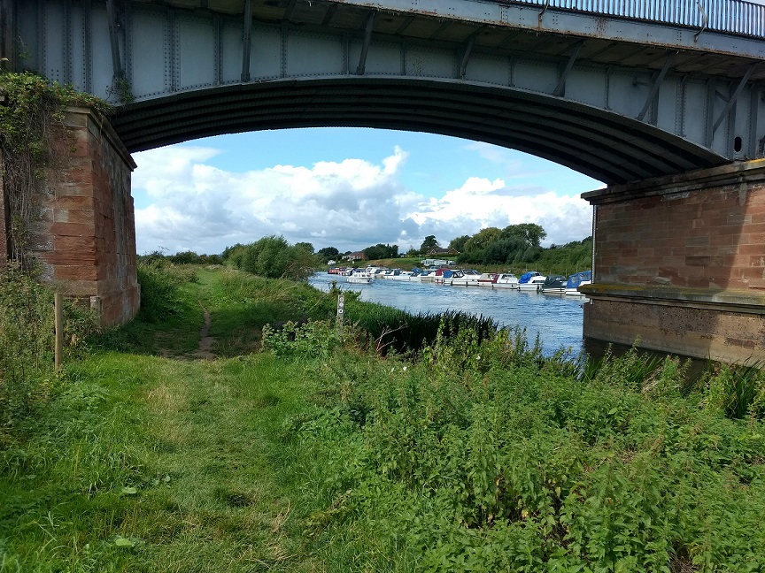
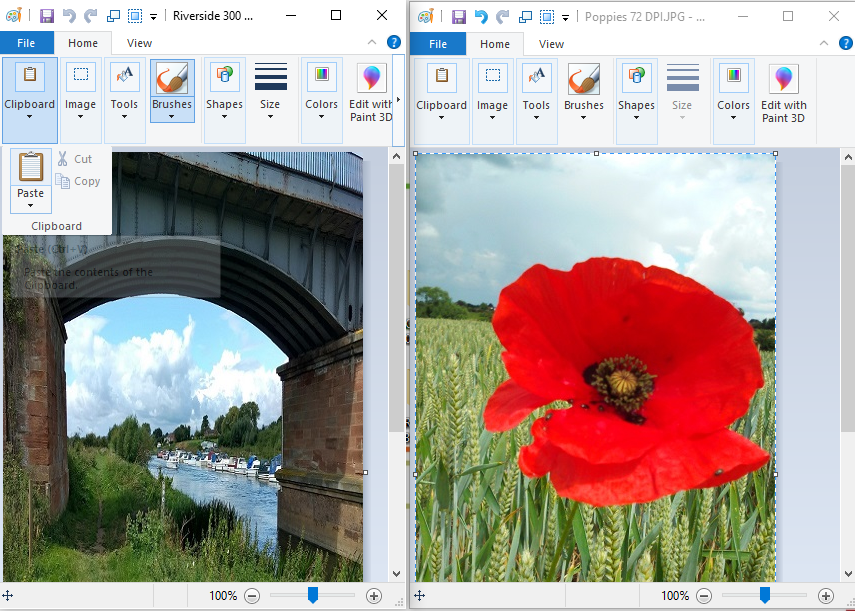
I am going to convert a Poppy picture to 300 dpi by pasting it over the Riverside photo but first I need to change the dimensions of the Riverside photo to be the same as the Poppy.

To get the dimensions of the Poppy image right-click and select Properties/Details:

Make a note of the dimensions (360 pixels x 640 pixels). This is the size I must make the 300 dpi Riverside image in order to use it as a template.
To resize the Riverside image, open it in Paint, select Resize, check the Pixels radio button and over-type the dimensions with those of the Poppy. Be sure to uncheck the box ‘Maintain aspect ratio’, which is checked by default.

Save the picture with its new dimensions. It should be distorted and the same size as the Poppy.
The last step is to copy the Poppy image and paste it over the Riverside image.
Open both pictures in Paint, in two separate windows:
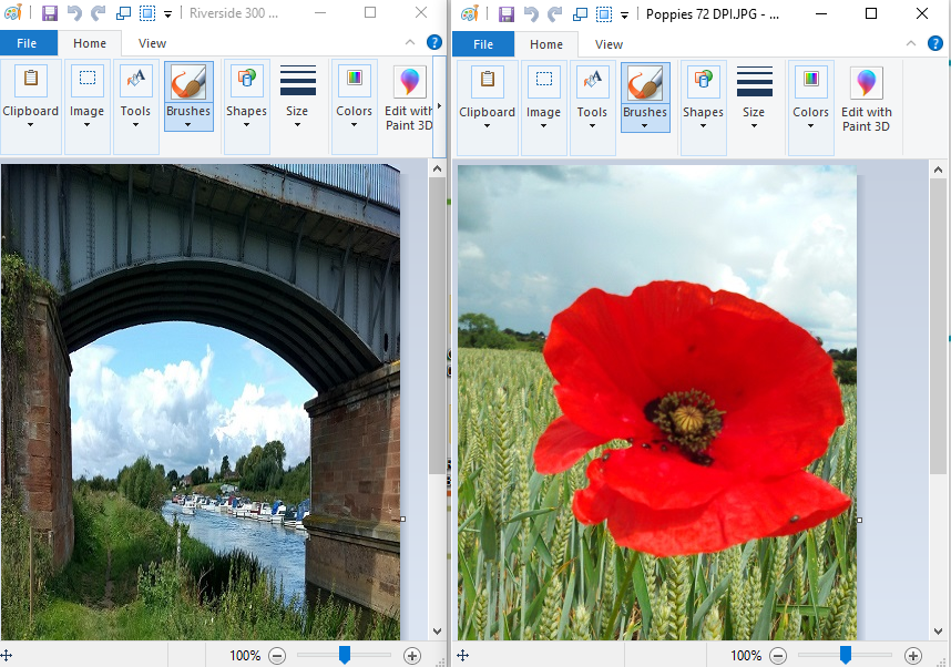
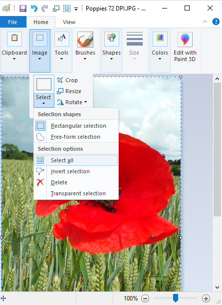
Copy the Poppy – Image, Select, Select all
Click the Clipboard tab – select Copy

Move over to the Riverside photo. Click the Clipboard tab – select Paste
After paste …

The Riverside image becomes the Poppy at 300 dpi. Save it now and remember to rename it.
Of course if you have several images to convert to 300 dpi that are all the same size there is no need to repeat the re-sizing process. Just keep a copy of the first converted image and use it as a template to paste over.
Hope this helps!
Goodbye, Dear Starman xxx
The news that my life-long hero had died came not long after the passing of my lovely old friend, Peter. Early in the morning, listening to the local radio to catch the traffic update, I was listening to opinions about the usual fascinating topics; car parking, fuel prices and dog mess when the presenter casually mentioned that news had just come in that British singer-songwriter …..(road noise and poor reception) had died. The name was said quickly and without much emphasis – so surely he didn’t say ‘David Bowie’! I turned up the radio in preparation for the next news and was gutted to hear it confirmed.
It was a weird day, blundering through the induction programme at my new job whilst locked in a mind-loop with a snippet from Five Years, “News guy wept and told us Earth was really dying”. I suppose I felt that this particular news should have been delivered with more importance – not just thrown in the gap between the petty complaints and the traffic jams. I am so sorry for his family and hate to think he was ill for eighteen months and we (the public) knew nothing of his suffering.
The radio tributes during the journey home … his voice on my favourite records being played that day were difficult yet compelling to listen to. I was taken back to the first time I saw him on TV. ‘Top of the Pops’ was on and I must have been about five and not really interested until Space Oddity came on with that video! Mesmerised, I fell in love with him during those few minutes and have been captivated by him and his work ever since.
During that early phase when he supposedly lived on green peppers and white powder I used to fear that he would die young, but in later years and happily married to Iman, he glowed with health and appeared always at ease … kind and humble with a slightly wacky and contagious sense of humour. I decided he would live to a grand old age and so the news of his passing came as a shock, and a sense of losing someone who had been with me always. Of course he still is here as I knew him. I still have his music and videos, which is all I ever did have. Thanks for the memories, dear David xxx
Bowie will be here forever on the earth plane owing to the wonderful legacy he has left us, and I expect he has already adapted to the afterlife and is fitting beautifully into His scheme of things.
If a picture paints a hundred thousand words: painting compared with writing
I used to try to paint pictures … many years ago. I was never satisfied with the finished effort, which wasn’t anywhere near as good as the picture in my mind that I was trying to replicate. My subjects were usually imaginary creatures. I would picture the main subject; maybe a dragon coiled in front of a Gothic castle, and sketch the outline but then when I came to fill in the background the mind work would begin. Was the castle on a hillside? How much of the background was sky and how much was land? What kind of sky or land? Was the light-source from the moon … if so, from what angle? How about the dragon; was it dozing, or warily guarding the castle, or angry and fearsome? Should the dragon be painted in fine detail, down to its individual claws, or would an impression of claws be more effective?
Painting a picture has some parallels with writing a novel. The novel starts with a visualised scene or an idea that inspires the writer to create a plot that includes the central characters – the secret friends who are with you night and day. You already know, understand and admire them, and you want the reader to feel the same about them. For this to happen you have to think about the details. How do your characters react in given situations? How about their style of speech; the way they dress, the way they move? What sort of homes do they live in? Has anything significant happened in the past that has shaped them? Could some of this detail be narrated or would it be more effectively conveyed as an impression through their actions and dialogue?
Writing suits me better than painting – and not only because I get better results with no mess to clear away afterwards. When I used to paint, if I realised too late that the composition was wrong I found it impossible to salvage, whereas with a novel I am able to go back and change the beginning or insert extra chapters or add some twists and turns to make up the length if required – although I’m not sure how well that would work if I was asked to provide a synopsis prior to beginning a novel!
Lately I have been trying to clear things out of the house to make some space. I still have my large art folder containing the artwork I did at school thirty years ago! I can’t keep such things for ever but there are a few pictures I might hang on to. I will throw out my paints though – they can’t be much good after all this time! I decided to take photos of the best few pictures and post them on this blog. Then, if I decide to chuck the lot out there is still a record. I never improved on my school work, and the photographed images somehow look better than the real things – and I like to see pictures on the blog.
So here they are …


Cover design by Dean Harkness
I have just received the finished book cover and I’m ever so pleased with it.

Thank you Dean!
My duff cover design

I thought I’d exhibit this here, since it will never be used. If it makes anyone laugh then the time it took me to create it hasn’t been wasted! I know it looks uninspired, but I probably would have used it if the print on the back had been okay. The flask and champagne glass are supposed to represent Serge and Leo. Serge has an attachment to thermos flasks and keeps one with him at all times, and Leo has had a life of celebrated success until his world falls apart. A shattered champagne glass would have been more appropriate but I was not prepared to break the glass for the sake of my art. Well, I did consider it, but was worried about the dog’s paws – and it would probably have broken all wrong; either shattering beyond recognition or just snapping off at the stem. I expect anyone who knew what they were doing with Photoshop would have used separate images of the flask and champagne glass and overlaid the glass over the flask at a more dramatic angle. I simply put a coaster under the edge of the glass to tilt it as far as possible without it falling over!
I emailed the jpeg file to my chosen printing firm, Imprint Digital, asking is they could print it off on paper to see if the small print looked readable and they were good enough to print in on card and post it to me the same day. I was most impressed with the quick and helpful response from Imprint Digital, but it confirmed the doubts I had about the quality of my file, as the writing was still blurry and pixelated despite the high-spec printer. I was no longer able to blame my tools. Now I am glad that the print is blurred, otherwise I would have made do with it, and it’s really not very good, is it?
“The Rise of Serge and the Fall of Leo” (Kindle)

Click image for Amazon Kindle link - Currently just 99p !
