My lovely old Mum has advanced Parkinson’s and is receiving ‘end of life’ care in a nursing home. Someone from the home will let us know if there is a change in her breathing pattern to indicate that the end is near. Meanwhile, she is sleeping peacefully and unresponsive. At least I thought she was unresponsive – but today I’m not too sure.
Last weekend, for the sake of making conversation with someone who is comatose, I told her how my journey had taken an hour longer than it should, owing to the M42 being closed for works on the white elephant HS2 viaduct. This Sunday, if she could hear me, she must have been rivetted with the news that there was yet another 6.5-metre-wide abnormal load travelling up the M1 at 10 mph, with all the rest of us trailing along behind it … all deep, meaningful conversation!
I found Don Williams on YouTube singing “The Ties That Bind” and played it to her from my phone, reminiscing about how the song became our favourite about forty-five years ago, when her car, which had previously been Dad’s, had an 8-track cartridge player, complete with a few cartridges that were Dad’s choice of music.
I played the song again and sang along, not too loud, I hope! I noticed her breathing became slightly audible, with a very quiet murmur on each exhalation, and hoped this wasn’t the previously mentioned change in her breathing pattern. Maybe she was either singing along or asking me to keep quiet.
I mentioned it to the carers, and they said they had noticed it too sometimes when they were talking to her, and when I asked a lovely family friend who visited regularly, she had also managed to get this response. So, Mum is still with us!
As I left for the evening, the nurse on duty said he doesn’t think she’s ready to go just yet…
All week, I’ve been carrying my phone everywhere because if I leave it in another room, my current ringtone, Bowie’s “Starman” starts playing in my head, and I think I’ve missed a call.
A funny thing happened mid-week, when I phoned the home to ask if there was any change. Someone took a message and a lovely nurse phoned from another number and assured me they’d ring back if there was any change … so you can imagine how I jumped when ‘Starman’ blasted out later that evening, whilst the phone was in my hand, with that same number on the display.
What followed was a bizarre conversation where I confirmed several times who I was, thinking the caller was being ultra-careful they had the right person before imparting bad news. It wasn’t until she asked, “is Penny there?” that I realised the caller was a resident with dementia, who must have picked up the nurse’s phone and pressed last number redial. It turned into a lengthy phone call!
This is a very strange time, being in limbo, knowing that Mum is going to die soon. Not that she’s had much of a life in recent months, being hoisted from a bed to a chair and barely being able to communicate. Yet she’s never complained bless her. Two years ago, when she was in hospital after falling and breaking her hip, I got tearful, saying how much I hated seeing her like this, and she replied with her typical Yorkshire understatement, “I can’t say I’m too chuffed about it myself.”
Tonight, I’m at a lovely quiet campsite I discovered. Well, it’s quiet apart from the planes taking off and landing at the local airport … but that’s far preferable to people deliberately making a row at the Travelodge, and it’s lovely to be here in the cool fresh air with the wind blowing around the tent.
I feel quite calm, being not too far from Mum, drafting this blog post with song lyrics looping around in my head. Does anyone else have that going on all the time? Whilst I know every lyric of every 70s Bowie song, it can be annoying if I only know a couple of lines so they have to keep playing on repeat!
Tonight’s internal song, as the title of this post might suggest, is James Blunt’s “Carry You Home” and it’s making me weepy …
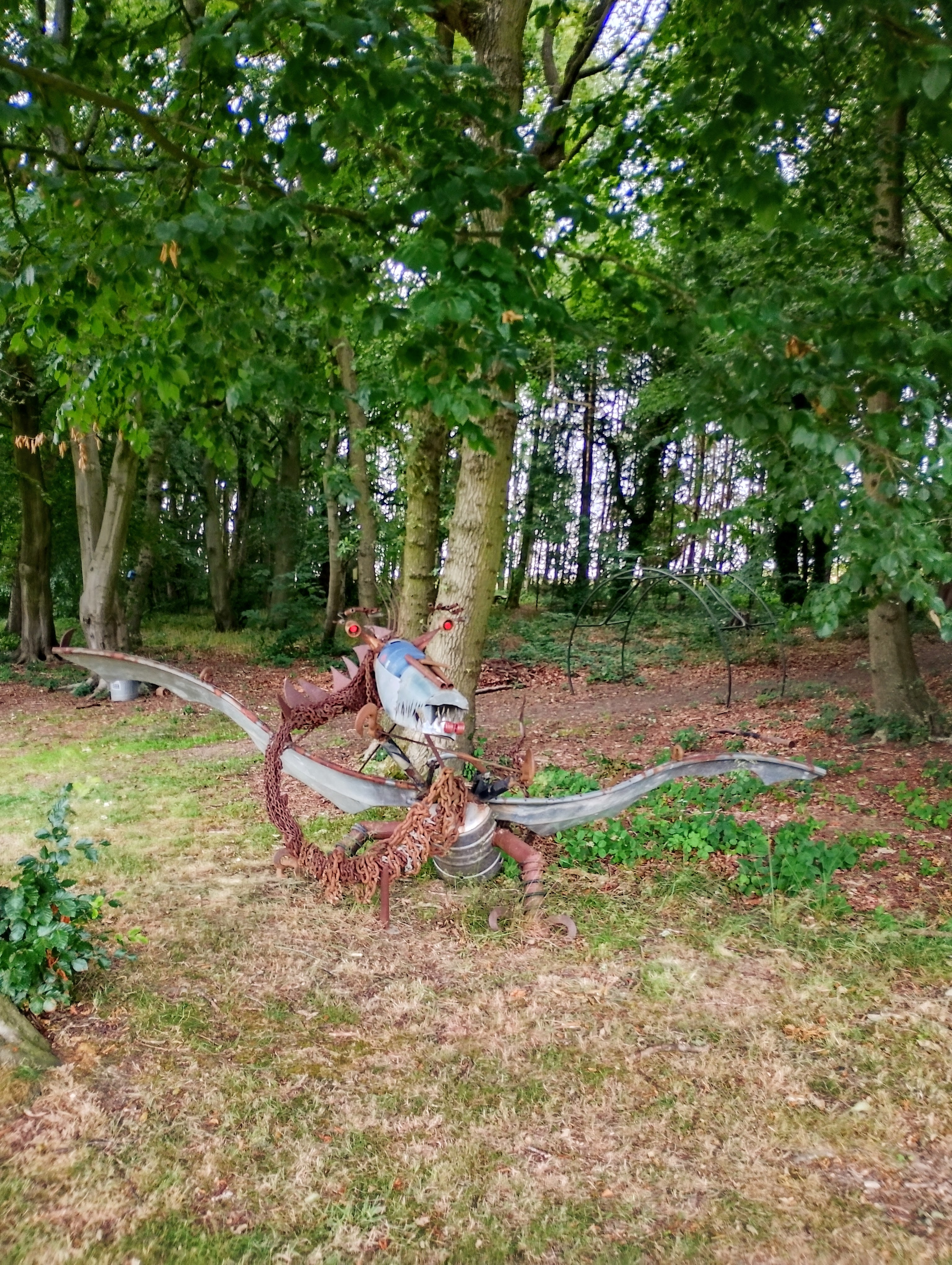
To separate Sunday from Monday, here’s a lovely mixed-metal dragon sculpture, for no other reason than that was lurking outside my tent:
Monday morning, I packed up my stuff and headed back to the care home, with the intention of sitting there for a couple of hours before heading back down the motorway.
I nipped in the big Tesco just round the corner from the home. As usual, it was difficult to get out of the place, with its long row of closed checkouts, and a queue for the self-service with one staff member ducking around cancelling the “unexpected item in the bagging area” message that happens if someone breathes too heavily near the scales. Anyone in a hurry was regretting trying to buy alcohol, anything sharp or anything with a security tag. I wasn’t worried about the time; I thought it was possibly a bit too early to turn up at the care home.
As I pulled into the carpark, Bowie was singing “Starman” from my bag. That would be my brother ringing to ask what time I’d be there so we could meet up. I parked and called him back, and couldn’t believe it when he said he’d had a call to say Mum had just passed away. Whilst I was round the corner checking out of the bloody supermarket!
She was still warm, and looked exactly as she had the previous day, but so perfectly still, not breathing.
When I started writing this on Sunday, the title of my post ended with a question mark, which I’ve just removed.
I wonder if “The Ties That Bind” would be appropriate for the service?
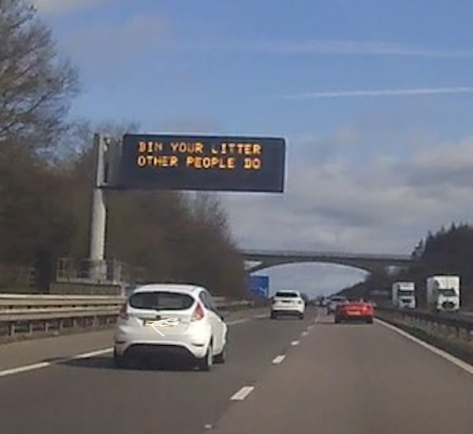
This frame, exported from my Dashcam, wins the prize for the most irrelevant and patronising road matrix sign that has ever distracted me on the motorway. What made it worse is that the next sign, which I almost missed because there was a lorry in the way, bore a pertinent message that the M1 was closed between junction 29 and 30.
Of course it’s important to bin your litter! It’s awful to see rubbish strewn along the roadside, but please could these overhead notices on fast roads be limited to relevant messages about the road ahead, allowing us to concentrate on the traffic, rather than taking advice on how we should behave?
It’s the “other people do” that riles me … hitting on the sheep mentality of the human race, with the implication that people are less likely to chuck their litter out of the car window if they are told other people put their litter in a bin!
Whilst that was the prize winner, the other entries during the four-hour journey were: “DON’T HOG THE MIDDLE LANE” (mostly ineffective, and on four-lane motorways, we now have third-lane hoggers); “DON’T DRIVE TIRED” (strategically placed when approaching the services), and “J40, 10 MILES, 6 MINUTES” (do people see that as a challenge?).
Finally, I arrived at my Mum’s care home. She was peacefully sleeping in her chair in the community area that was busier than usual for a Sunday, a bit like the roads had been. I kissed her awake and wished her happy Mother’s Day, and her lovely face lit up with recognition. She asked me who all these people were. At first glance it looked as if there were twice as many residents as usual … but us extras were just old children who’d come to visit our ancient mums on Mother’s Day!
I got chatting to a man who looked like a wizard, with long grey hair, whilst our respective mums dozed off again. When he told me his mum was approaching her hundredth birthday, I realised he was probably heading for eighty. He told me he had no intention of moving into residential care, and I replied that it wasn’t for me either. I told him it worried me that (in years to come) I might have a medical episode in a public place and get carted off to hospital – and then you’re in the system and what if you can’t get out?
When he replied that he hadn’t really thought about it to that extent, and looked a little concerned, I wished I’d kept my trap shut or talked about the weather, or something equally interesting … the motorway matrix signs, maybe?
Visit over, I headed to the Premier Inn. I normally book a Travelodge and was interested to see how the two compared. Premier Inns are slightly more expensive than Travelodge, and both do “dynamic pricing” making them more expensive if there is demand owing to an event, but Sunday is generally cheap, so I decided to try it as my usual place has gone a bit seedy in recent months (people smoking outside in pyjamas, pungent tobacco smells, hooded kids on bikes tapping on windows with deliveries, stuff like that).
My room at the Premier Inn was nice and quiet – perhaps because it was at the end of a corridor. Also, there wasn’t the constant banging of doors that reminds me of the start of the 1970s TV sitcom “Porridge” that was regularly on our TV, with the prison cell door slamming with an echo …
The layout of the room and the facilities were pretty much the same as I was used to down the road. The only thing that let it down was that, although it looked very clean, the ensuite smelled slightly of male piss. It was a smell I recognised from when I worked at a warehouse and the ladies’ toilets would sometimes smell that way if the floor had been mopped without changing the water that had been used to mop the floor next door in the gents’.
With the bathroom door closed, it was cosy as I stirred boiling water into my instant mash (not a pot noodle fan) and tucked into my salad box, whilst enjoying a drop of wine I’d decanted into a plastic water bottle to bring along.
Next morning, not too early, I visited Mum again. She asked how long I was here for, and I said I’d head off at my usual time, when they started getting lunch ready. When she remarked that I normally visit two days running, I reminded her I was there yesterday. We then had a recap of Mother’s Day, which gave us something to talk about …
Back down the motorway, I was pleased to find Greggs at the services had some spicy wedges left. I got home at a reasonable time, and unpacked the ridiculous amount stuff I’m compelled to take away with me just for one night.
I also binned my litter … because other people do.
In the mid-1990s I attended a weekly spiritualist church meeting in Hereford. I can’t remember the exact location, but it was some sort of parochial hall building, draughty and shabby with a stage at the front, and hard chairs that scraped noisily on the wooden floor. The location doesn’t really matter, but when my internet search was unsuccessful, and nothing rang a bell on Google maps, it made me wonder how we found our way around back then. Few of us had internet access or sat navs, yet we still managed somehow.
Each week, I went along hoping Anton would be there. I’m calling him “Anton” here, because that’s how we pronounced it, and it’s what I’d thought his name was for the past thirty years. I’d never seen his name written down, or heard his surname used. The name “Anton” was enough to make everyone’s face light up, as his kindness, humour and cheerfulness always lifted the atmosphere of the dingy venue a good few levels, and brought warmth and laughter to the gathering. I never even spoke to him … I sat near the back and slunk away after the closing prayer, before the tea and biscuits came out.
Whenever Anton was there, the meeting was attended by a group of students from the local college for the blind. I don’t know whether Anton attended the college as a student or as a mentor, but he always had a good following, and would chide them good-humouredly when their talking watches, all slightly out of sync, would pipe up and announce the time at an inappropriate moment.
Yesterday, I discovered that “Anton” was in fact Antoine Reeves. As the title of this post suggests, Antoine was a medium and he was blind. He was also a talented musician who would bolster our attempts at hymns with his keyboard accompaniment and sometimes treat us to a rendition of a song he’d composed … as well as giving us a demonstration of mediumship.
I recall an evening when someone’s loved one had come through, and Anton was delivering their message, he paused after the words, “in the Spring, when the birds are singing in the trees”, and asked us, “What does he mean by that?” Someone enlightened him that birds often sit in trees and sing.
“Do they really? Well, I never knew that!” said Anton, with his characteristic eyes-closed, crinkling smile, and continued with the message.
I moved away from Hereford and no longer attended those meetings, but often thought of Anton. In more recent years, I’ve googled “Anton blind medium Hereford” with no successful results.
Yesterday, I was telling my partner about him, and mentioned the occasion he’d questioned “birds singing in trees” because, being blind, that was something he’d never seen … and there must have been so many other things!
I also told him how Anton had amused the congregation when he mimicked his mother yelling down the garden for him to come indoors. His voice had transformed as if channelling her – but it was a strong Jamaican Patois that boomed around the hall. He then explained, in his usual dulcet northern tone, “My mother came from Jamaica, you see,” and we all laughed at the vocal contrast.
I ended by telling Julz that if only I knew Anton’s surname, he’s bound to be somewhere on the internet … and then “Reeve” or “Reeves” suddenly came to me. Maybe I had heard someone say his full name all those years ago, or perhaps it’s because Rachel Reeves keeps getting mentioned in the news?!
Anyway, I googled “Anton Reeve” and found Antoine Reeves! No mention of his work in Herefordshire though.
Sadly, he passed away in 2021, aged sixty-six, according to this lovely tribute I found:
I’d like to think he wouldn’t have minded returning to spirit, as he’d spent years bridging the gap between the two worlds.
I also found his recording on YouTube of “Mother”, a song I find even more moving now than when he sang it for us, accompanied by his keyboard, about thirty years ago:
Last night, during my early-hours wide-awake time, I thought about Antoine, and asked him for a sign that he was still around.
This morning, when I went for my regular woodland wanderings, a robin appeared on the path in front of me. I stopped and it flew up into a tree, perched on a low branch, and chirped a little melody.
“Antoine!” I called softly, and instead of flying away, he tilted his head as if listening, and repeated the song again. We carried on this exchange, me and the robin, for a couple of minutes until I saw some dog-walkers approaching and moved on.
Perhaps it’s just that I was looking for a sign, as robins are often quite tame, but I’d prefer to believe it was Antoine checking in by singing in the trees, bless him.
Whitby is a beautiful seaside town on the east coast of Yorkshire, England. Like most lovely places, it’s become very popular and is much busier than when I first visited. That would have been August school holidays, so I’m going way back! It used to be lively but not over-crowded, but these days the pavements in the town are crammed whatever the time of year.
Fortunately, there’s still loads of space on the beach when the tide is out. We don’t currently have a dog, but enjoyed watching them enjoying a bit of freedom. Where we live, the land is mostly privately owned or common land grazed with sheep. Dogs are not allowed on playing fields, so they tend to be confined to public footpaths. We have a disused railway track that is popular for dog-walking. We also have a scourge of dog owners – mostly posh older ladies – who disregard the on-lead/off-lead etiquette and allow their off-lead dogs to go charging up to dogs that are on their leads.
Only this morning, my attention was drawn by an emphatic, carrying voice, “Oh please don’t do that, Walter. You know how much you hate it when other dogs sniff your bottom!” … whilst the other dog pirouetted on the end of his lead, tail between his legs, trying to keep his bits covered.
Sorry, digressing already! Back to Whitby and the space on the beach …
I stood for a moment gazing at this cliff, reflecting on the floral tributes and love-locks on fences, and trying not to think too hard about the rocks below:
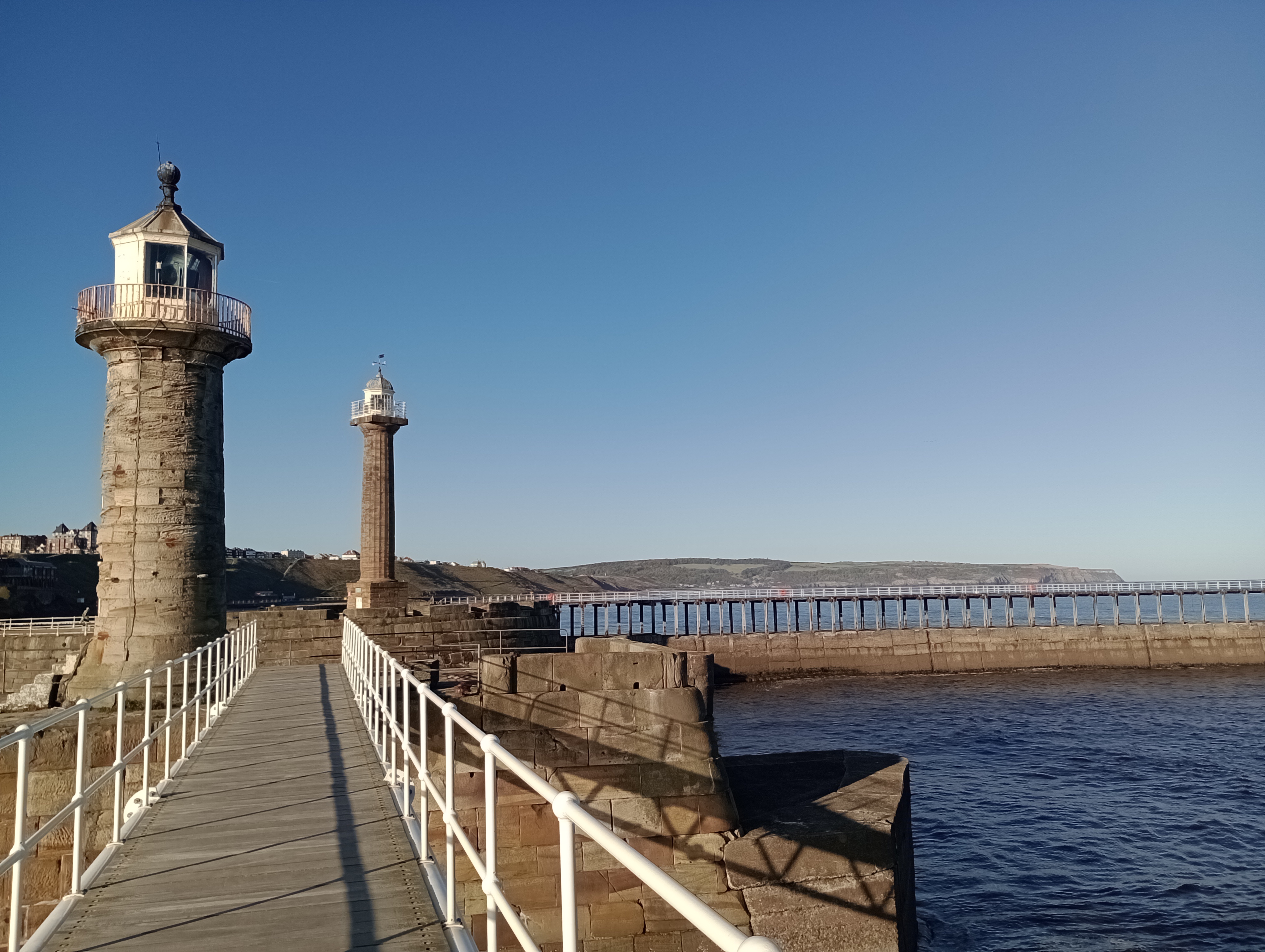
… and of course I took lots of photos of the lighthouses 🙂
We stayed in the same flat as last year, (me and Julz). It’s small, basic and comparatively cheap. We took our own pillows this time, because last year there was a cheesy old dog smell that seemed to be infused in the soft furnishings of the bedroom. Happily, this year the smell had gone (new bedding, I think) and the place was scrupulously clean. The flat is up a few flights of stairs within an old building, and lots of its fixtures are tired and worn and don’t quite work properly. I know how they feel! It was a relief to leave the place without breaking the hot tap, as it had to be turned overly-tight to stop the water trickling out.
But the view from our window was priceless!
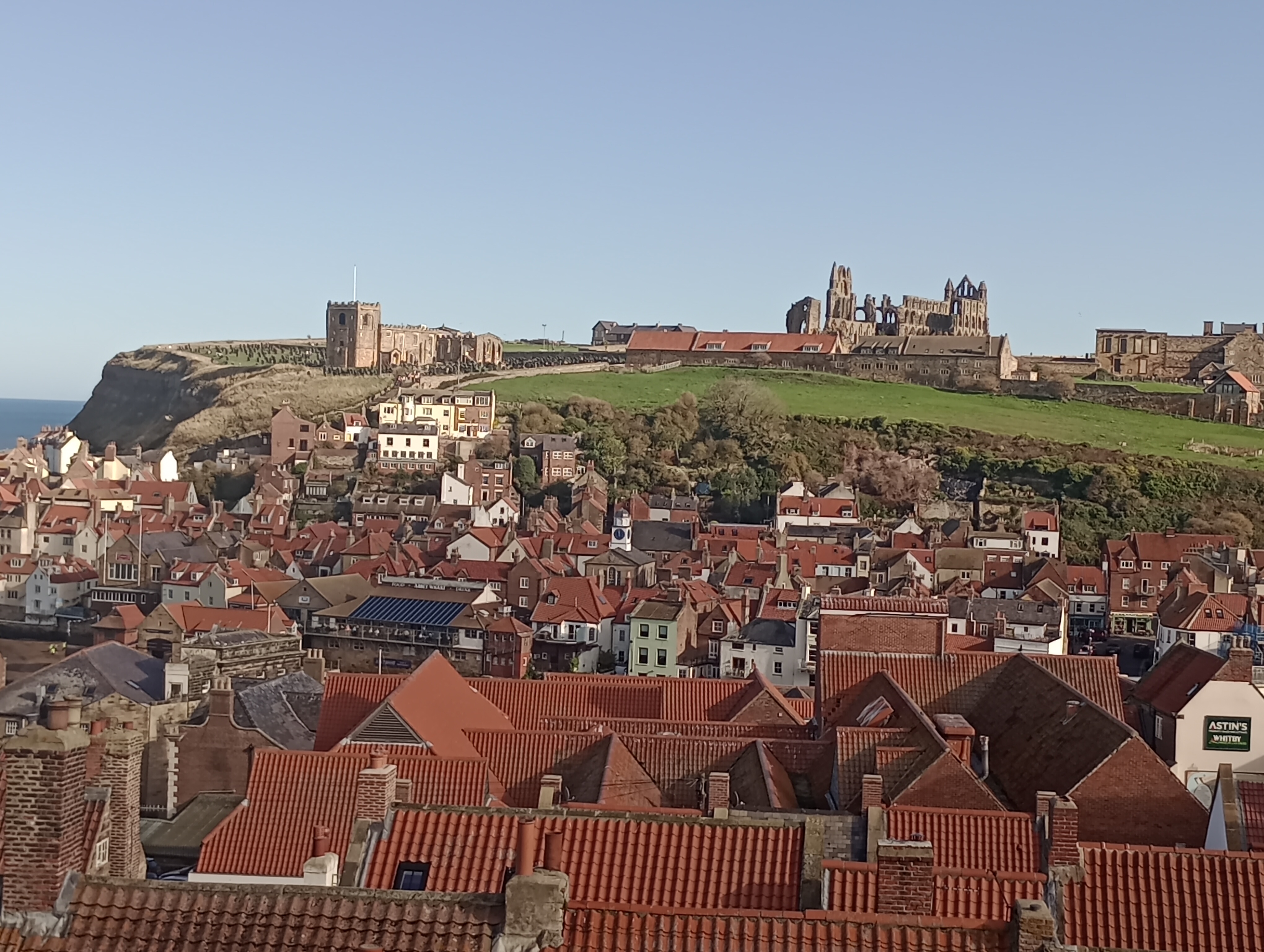
Whitby Abbey was a source of inspiration for Bram Stoker’s ‘Dracula’. It’s easy to see why, as it’s very atmospheric. Here’s a closer look:
On the last afternoon, we called in the Elsinore pub for a pint, before retreating back to the cosy flat for the last evening. Scrolling through Facebook posts, I discovered I’d missed my favourite royal, Princess Anne, who had visited the ‘Save the Children’ charity shop, just a few doors down from the pub. What a shame we didn’t stay for another drink!
When it got dark that evening, the abbey came alive as different coloured lights were beamed at it. Presumably, this was a test run for the ‘Illuminated Abbey’ event, which was scheduled to start the next day, so I guess it’s still going on now.
This was my final photo, until next year … all being well 🙂
Ed returned to the table with two overflowing pint glasses and placed them on the soggy beermats.
“Cheers,” said Ryan. “Looks like it’s just us tonight. Cal and Vinny have got better things to do … again.”
“Yeah, Cal’s got a new girlfriend, so it’s all about her at the moment.”
Ryan downed half his beer in one go and wiped the foam from the top of his lip. It had been a long week at the factory, with overtime this morning, but finally it was Saturday night. “Cal will be back when the new love fizzles out. It’s becoming a pattern. As for Vinny, he’s married to his bloody YouTube channel!”
Ed picked up his mobile. “I messaged Vinny to let him know we’re here, but he hasn’t replied. Too busy ghostbusting, I guess. He’s got a good few more subscribers though … and loads of comments …”
“Have you read the comments?” laughed Ryan. “It’s mostly just people slagging off his ghosts as fake and arguing amongst themselves about what tricks he’s used to make them! Doesn’t ‘Vinny’s Paranormal Productions’ suggest it’s all made up?”
“Yeah, but good luck to him – if he gets enough subscribers he could quit the day job. Young Vinny’s a good lad but not really cut out for the factory. He tries to go along with the banter but you can tell it winds him up.” Ed hesitated before adding, “Maybe leave off making ghostly noises every time you see him in the locker room, it’s wearing a bit thin. Anyway, it looks like the band’s getting ready to start …”
Vinny removed his head torch and pointed it down as he left the public footpath and trod carefully across the field towards the makeshift grave. At least he hoped he was heading towards it. These fields and woodlands were close to home and he knew them quite well, but the darkness of the night gave them a whole new perspective and he’d already lost his bearings a couple of times.
He reached the barbed wire fence and stopped for a breather. The rucksack on his back was weighing heavy with cans of beer … at least it would be lighter going home. It was Saturday night after all, and just because he wasn’t out with the lads didn’t mean he couldn’t enjoy a few beers, and the small bottle of Jack Daniels he’d added as an afterthought. That would go down nicely on this chilly October night.
Running his fingers lightly along the barbed wire, Vinny wished he’d thought of bringing a mat or something to put over the spikes – but dumped his rucksack on the other side, switched off his torch, pushed down the wire and went for it, trampling down the brambles on the other side. As his eyes adjusted, the white stone cross that marked the grave became gradually clearer until it seemed to be glowing. He moved towards it then paused, startled by a scratching sound … but it was only thorns and shrubs scraping against his coat and bag.
It was two months ago, on a sunny morning in August when he’d first noticed the white stone cross, after being lured to pick a few ripe blackberries that were hanging over the barbed wire. There was no inscription to be seen, and although there was a mound of earth, it had grass and weeds growing over it, so it hadn’t been dug recently. Maybe it was the grave of the landowner’s beloved dog?
He cast his mind back to that sunny day, trying not to feel so edgy, but it wasn’t really working. Putting down the rucksack again, he extracted the whiskey and took a swig. It made him cough but he followed it up with a bigger swig. Why was he feeling so spooked? He was only here to record some footage to take home and edit with a bit of chroma keying and masking, so other people would be spooked by it! The whiskey had gone to his head already so he put it aside, and downed a can of lager.
Making sure the camera was recording, he checked his appearance and adjusted his hat to a more flattering angle, then zoomed out a little so the white stone cross was in the frame, and went into character of his YouTube persona. With a fetching smile, he welcomed his viewers, and launched into the introductory spiel that he’d mentally rehearsed from his internet findings.
“Wraiths are usually spirits that have an unhealthy attachment to the mortal realm. They can change their form to deceive people, so they might, for example, take on a human form to lure another person or gain their trust. By changing its appearance, a wraith can adapt to different environments, allowing it to interact better with the physical world -”
He stopped, startled by a noise that seemed to come from above … looked up at the trees then back to the camera, “Did you hear that? Sounded like an animal. I’ve heard weird noises coming from squirrels, but they don’t come out at night, do they? Anyway, I was telling you about wraiths … they can alter the perceptions of any person they touch, making emotionally unbalanced or even making them hallucinate.”
A rustling noise sent him spinning round, cursing as the brambles hooked into his clothes. He thrashed around a little, exaggerating for dramatic effect, then returned his gaze to the camera. “Sorry guys, I don’t know what that was. Noises are so much louder here in these quiet woodlands. One morning, I thought I could hear someone using a rake, but it was just a blackbird kicking up the dry leaves to look for worms. How could a small bird make so much noise? But the blackbirds are in bed now, aren’t they? Wherever blackbirds sleep!”
Vinny shivered and zipped his coat up as far as it would go. It had been a mild day for the time of year, so why did he suddenly feel freezing cold? He leaned into the camera. “Back to wraiths. Whilst they don’t actually make people insane, they latch on to the already-fragile elements of their victim’s psyche to make them even crazier!” Widening his eyes with a zany expression, he concluded, “In a nutshell, wraiths are attracted by unstable emotions.”
Pausing the camera, he knocked back some more whiskey and thought about his mates in The Prince of Wales … wishing he was there on a comfy seat, in the beery warmth, with background chat instead of inexplicable spooky noises. He knew he’d get some stick from Ryan on Monday morning, for ‘putting his channel before his mates’ but with the alternating shifts at the factory, and the mandatory overtime if they were behind with production, he only really had the weekends to record and edit his videos and get them uploaded to YouTube. His subscriber and viewing stats had gone up this month, which was encouraging. Particularly if he was ever going to get out of the shitty factory job and a single bed in his dad’s flat.
There were guys at the factory who’d been in the same role for twenty years, and seemed proud of it. Vinny was depressed by the thought of still being there this time next year, let alone another eighteen. His dad said he should have tried to get a place on a course in plumbing or ‘something useful’, rather than the Multimedia Film Art course he’d opted for. Was it so wrong to want to spend his life doing something more creative than fixing people’s toilets?
On the subject of toilets, he could do with a piss, but it wasn’t going to be easy amongst all these thorns and prickles. He stepped back away from the cross but the brambles scratched noisily against his coat and pierced through the fabric of his jeans. Only one thing for it! “Look the other way for a minute, guys” he said into the camera as he turned it away … he would edit that bit out. He stepped forward into the clearing and pissed noisily onto the grave, laughing drunkenly at the incongruity as it splashed up the white stone cross.
Tucking everything back in, he moved away and sat on the flap of the rucksack to enjoy another beer and the last of the whiskey. Steam was rising from the earth in front of the cross, so he grabbed the camera to capture it. He felt bitterly cold, although there was no frost, in fact it had been a warm day for the time of year, so he was surprised to have made the ground steam, but it did look pretty awesome. He watched, mesmerised by the curling white hoops that rose and dispersed into the ether …
How long had he been recording this phenomenon? The white vapour was intensifying rather than dissipating and the surrounding air felt freezing. Jolted by the sensation of icy fingers touching his face, he hung the camera round his neck, scrambled to his feet and took a step back, holding out the camera as if recording events would somehow protect him from them.
A beam of red light began to glow through the dense shrubbery behind the cross. Vinny opened his mouth to ask who was there – but no sound came out. Another light was now glowing alongside the first … like a pair of demonic eyes piercing the darkness, watching him. Fixated by their glare, all he could do was stare back at them, until one of the lights began to advance and formed an aura around the silhouette of a cloaked figure …
A guttural scream, which he realised had come from himself, spurred him into action and he turned to run, stumbling over his rucksack, tearing through the vicious blackberry bushes, and ripping his jeans scrambling over the barbed wire. It was downhill now to head for home, and he took a tumble when his legs couldn’t keep up with the speed of his descent. It wasn’t until he left the footpath behind and saw the lights of the town that he checked his precious camera was okay. Fortunately, it was fine – it was even still recording … not that he felt like watching the footage any time soon. He switched it off and secured the lens cover.
He was still shaking and his legs felt weak. He could turn left here and go home, or turn right and call in at The Prince of Wales. The town clock said he was in time for last orders – maybe text Ed first and check he was still there … except he’d left his bloody mobile in the rucksack up by the grave! He took a couple of deep breaths and tried to calm down. A quick blast of Friday night pub atmosphere might settle him – the warm lights of the town were helping already.
He hesitated as he got close to The Prince of Wales. The smokers outside were wearing their smart Saturday night gear, and he was suddenly aware of his torn coat sleeves and blood on his face where he’d been scratched by thorns. So long as he kept his coat on, no-one would see his jeans were ripped. It’d be fine.
Just as he decided to go for it, the pub door swung open and Ed walked out, followed by Ryan. They didn’t notice him and headed off towards their neck of the woods, on the opposite side of town to where Vinny lived.
“Ed! … Ryan!” he called, and they turned in synchrony and gawped at the state he was in. Their faces creased with laughter then they turned their backs on him. Vinny watched them vanish behind a happy bunch who were waiting for a taxi, then turned and went home, determined not blub in the street. That wasn’t like Ed at all … he was older and kinder than the other guys.
Late Sunday morning, Vinny started his laptop then went to make coffee. It would have finished booting up by the time he got back. Having decided this would be his final video, he didn’t even bother to edit it – just transferred the recording from the camera to the laptop and started the upload to YouTube. Meanwhile, he opened another tab and looked half-heartedly at plumbing courses before giving up and going back to bed.
The working week that followed was mostly spent trying to avoid his workmates, particularly Ed and Ryan … not easy as they were on the same shift, and clocked in and out and took their breaks at the same time. Whilst he longed for the weekend, he dreaded the emptiness of it. No video to make and no mates to go out with. Friday afternoon finally arrived, then the end of shift siren with no overtime this weekend. Vinny hung back with the other misfits as the main mob flung open the swing doors and jostled for position in the queue for the clocking machine – the racket escalating with the rush to the locker room for a quick getaway.
Thinking the coast should be clear by now, Vinny entered the locker room to ditch his work boots and hi-vis … and there was Ed, sitting on a bench, looking at something on his mobile. He stopped, wondering if he’d been seen. It seemed he had …
“Congratulations,” said Ed, without looking up.
“Urm, hi! Congratulations on what?”
Ed looked up with a slight eye-roll and spelled it out. “Congratulations on your latest video going viral, shared all over the web, and all your new subscribers. So, why have you been avoiding us all this week? Is this your last day and you were going to slink off without saying goodbye? … Well? Don’t stand there looking like a goldfish. Your acting skills are getting good though – you look genuinely shit-scared in this video … and your subscribers are arguing amongst themselves as to how you achieved the ghostly effects … I do like the bit where you turn the camera the other way, as if you’re going to pee on the grave!”
Vinny sat down on the bench next to Ed. “Do you mind if I have a look?”
Ed handed over his mobile and laughed as Vinny checked his channel, and his expression morphed from belligerence to incredulity and finally to delight.
“Didn’t you know it had all kicked off?” asked Ed.
Vinny shook his head. “My mobile was in the rucksack I left up the hill – along with all the empty beer cans … and I’m too scared to go back and get it.”
“Why have you been so off with us all this week? I know Ryan’s a bit of a mickey-taker, but he doesn’t mean anything by it. He doesn’t know how to be any other way …”
“After the way you both jeered and then blanked me last Saturday? You were as bad as Ryan!”
“Erm … what are we talking about now?”
Vinny recounted how he’d gone to The Prince of Wales to join them, but Ed shook his head.
“It wasn’t us. I texted you early Saturday evening to say me and Ryan were meeting at The Farmer’s Arms, our end of the town, since you and Cal weren’t coming – so you knew where to find us if you changed your mind. You didn’t reply … and then ignored us all week, like we’d done something wrong!”
Vinny shrugged. “I’m sorry, mate.” He returned the mobile to Ed. “I didn’t edit that video – I never even watched it. I wasn’t acting either. I need to go back up the hill and get my mobile, if it’s still there. My rucksack’s waterproof and out of sight of the footpath so hopefully it’s okay … but … well, I’ve lost my nerve. I don’t want to go back there again, or anywhere else spooky for that matter. Don’t tell Ryan I said that – or I’ll never hear the end of it!”
Ed rubbed his chin, thoughtfully. “How about we have a walk up the hill tomorrow in daylight and collect all the rubbish you left behind? I’d quite like to visit the famous grave from the viral video! My advice is to keep your options open and keep your subscribers guessing.”
In the late Saturday morning sunshine, the location of the grave was no more than a peaceful place to bury a pet, but Vinny still had no inclination to hang around there once he’d retrieved everything he’d left behind last weekend. Ed sensed Vinny’s need to get away, and held down the barbed wire for him to step over, then Vinny did the same for Ed, and they strolled amicably back down the hill.
“The thing is, I didn’t used to believe in ghosts, so going to spooky places at night didn’t bother me … but it does now.”
“Well, don’t go to spooky places at night then,” laughed Ed. “Shoot your scenes in daylight and use your editing skills to make them dark and scary … and if the sun shines through, make out it’s a spirit orb or something. Just see where it takes you! By the way, we’re going to The Farmer’s Arms again tonight. They have a band every Saturday. You’re welcome to crash at my place, so long as you don’t hang around all day tomorrow – I’ve got stuff to do.”
Vinny’s face lit up. “Cheers Ed! That would be great, if you’re sure!” He hesitated, then asked, “Did you really not go to The Prince of Wales last Saturday?”
“Nope, like I said, we were at The Farmer’s Arms all night. Once you’ve got some charge back in your phone, check out their Facebook page – there’s pictures of the band with me and Ryan sat in the background.”
“I know I was drunk and scared witless, but I’m sure I saw you and Ryan … I really don’t get it.”
“Don’t you? Well, I think I get it. There’s a popular YouTube channel that explains paranormal experiences in plain and simple terms.” Ed stopped walking, to find something on his mobile. It took Vinny a few seconds to recognise his own recorded voice …
“By changing its appearance, a wraith can adapt to different environments, allowing it to interact better with the physical world.”
Ed laughed, “Your face is a picture! I take it the penny’s dropped.”
About thirty years ago, I clambered up the slippery sides of a deep, dark well and then teetered on the edge of it for some time, staring back down into the murky depths and trying not to slip.
Searching for an existence that was different from reality, I had a few Tarot readings. I can’t recall being told anything of significance – I think the readers quickly intuited that I was one card short of a full deck, and provided a bit of counselling, then sent me away feeling hopeful about the future.
It was around this time I discovered The Connolly Tarot deck. Its brightness and positivity were just what I needed from the tarot back then – in fact I’ve just looked it up on the internet and found it summed up beautifully (by Aeclectic Tarot) as having “kinder, gentler tarot imagery with a Christian influence”.
Back then, I didn’t have internet access to track down a copy, but managed to get one from a lovely little shop call “Strangeness and Charm” that used to be in Worcester and sold that sort of thing. I think they actually ordered it for me. That’s how it worked before online shopping.
I took it home and spent some time looking through the cards and getting to know them. There was something healing about the images and their key meanings. They reminded me of stained-glass windows.
Instead of The Devil, we have Materialism and instead of Death it’s Transformation. In the ten of swords, the swords are pointing away from the subject as if her energy is deflecting them.
I quickly noticed the three of wands was missing, despite the deck being brand new and cellophane sealed. Oh well. I substituted one of the two extra cards in the box, which I guess are the equivalent of jokers in playing cards.
The Connolly Tarot became the deck that I’ve used regularly since that day. I don’t use them for divination – I’m not a tarot reader – I just like the cards and enjoy shuffling them and seeing what crops up when I fan them out face-down and randomly draw a spread. I’m sure the cards have their own energy, because I tend to do the same spread three times, and it’s uncanny how often the same cards come out, no matter how thoroughly I shuffle them.
Much as I love The Connolly Tarot, when I created The Lighthouse Tarot, I went for an entirely different feel, favouring a painterly style rather than clearly drawn outlines and borders. I reserved the sharpness for the symbols and text, keeping the background loose and flowing. In a much happier place, I favoured the traditional Rider-Waite-Smith definitions, with The Devil and Death, and with swords that are about to hit the target unless evasive action is taken. Remember, we are empowered to steer our own course – the outcome is not inevitable.
I’ve acquired a few other decks over the years but The Connolly Tarot is the only one I’ve really bonded with and use regularly. After thirty years, I should probably have got over the missing three of wands, yet it still irked me slightly when the substitute card came out in a spread. First world problem, I know!
Recently, I found a tarot card group on Facebook where people create “Magpie” decks by putting together their favourite cards from various split decks. I’m not sure how that works when the backs of the cards, and possibly the sizes are different. Surely you know which card you are drawing by the design on the back? Still, that’s not the point.
Members of this group trade the surplus cards they don’t use, so if anyone is searching for a particular card, there’s a chance someone out there might have it. I asked, and someone from the USA responded that they had it going spare 🙂
It was no surprise that when I knew the three of wands was heading my way, the substitute card cropped up persistently in my Celtic cross for a week or two. The cards also tend to reflect my mood, so if I’m in a funk, all the swords come out!
Well … I drafted this post over a month ago, and the three of wands appears to have lost its way. Is this a message from the universe that my deck is complete as it is? Or simply an indication that the postal service has gone to sh*t!
Will it turn up now that I’ve shared this? Don’t worry, I’ll let you know! 😉
November has become men’s month where we celebrate their achievements and spotlight the issues affecting men’s health and wellbeing.
We have International Men’s Day on the 19th November, and of course the Movember taches will be taking shape to raise funds to support mental health and suicide prevention, prostate cancer and testicular cancer.
As a woman, I give thanks for the lovely men I have been blessed with, not just the men in my family but all the amazing work colleagues I have teamed up with over the years. I also feel privileged to have been born at a time (in the 60s) when simply being female has given me advantages.
When I was a lass, no-one batted an eyelid when I went grass-sliding down slopes with the lads and made rope-swings in trees, but I’m pretty sure eyebrows would have been raised if the lads had taken an interest in my dolls, nurse’s costume and tea set. My school uniform only allowed skirts, but outside school I could wear what I liked, including my brother’s outgrown jackets and jeans, whereas boys all pretty much dressed the same. At school, boys did woodwork whilst girls did home economics and made awful scones that had to be levered away from the roof of the mouth with a finger.
I recall the time my brother looked glum because his school report wasn’t too good, and he was worried about what Dad would say when he came home from work. Mum explained to me that it was important for boys to do well at school because they had to get a good job, whereas it didn’t matter so much for girls.
Victorian ideals of gender were still lurking around in the late 60s and early 70s, sustained by our grandmothers. Men were the bread winners and women were homemakers, and men weren’t supposed to be effeminate, just as women mustn’t appear too butch. Grandma used to tell Slade to get their hair cut when they appeared on Top of the Pops!
It was these attitudes to gender that saw young men called up for National Service and put on the front line as cannon fodder … and November, with the Poppy Appeal, is a time when we particularly remember them, and reflect on the sacrifices they made.
Of course, gender roles are less clearly defined these days, with men having far more involvement in child care and housework. When I was born, Dad only had ten days annual leave and had to use it to look after my brother, as paternity leave didn’t exist and women were treated as if they were ill for a fortnight after they’d given birth. These days, many couples are juggling paid working hours around child care and spend their time off doing housework because it takes two wages to pay the rent or mortgage … so the old tradition certainly had its advantages.
Now that women have the same earning potential and career opportunities, does this mean there is less pressure on men? Or do some men feel they have to put more effort into being the ‘man of the house’? Maybe that might be the case with middle-aged men, but not so much the younger lads? Afterall, as youngsters we tend to accept the values of the culture we are born into, until we get to a certain age and then, hopefully, begin to question some elements of our normality.
Do men who need space feel their ‘Man’s World’ is now limited to the retreat of a garden shed – if they’re lucky enough to have one? Is no male territory sacred?!
Image by Stefan Keller
I included Stefan’s image because it made me laugh, but I’ve always found it odd that men are expected to get their tackle out in public toilets. I wouldn’t be too happy if I stopped for a wee at the services and found a row of toilets with no screens!
This digression is my signal to wind up, so I’ll leave it here … with massive appreciation for all our lovely men who are alive today and those no longer with us.
The UK clocks go back tonight so the days will be shorter and darker, so let’s look after ourselves and each other, regardless of our gender.
Mr Wintle had warned me his workshop was ‘off the beaten track’ but I hadn’t expected quite so many single-track lanes. At least it wasn’t raining for a change, but I couldn’t properly admire the views as I had to keep my eyes on the road ahead. I slow down and judder over yet another cattle grid, hoping my antique clock in the boot isn’t being rattled around too much.
It was Mr Wintle’s forty years’ experience with clocks that lured me to ‘Wintle’s Antique Clock Restoration’ – that and the five-star reviews for his business. Not that there were many recent reviews, so maybe he was winding down. I smile at my own weak joke, and recall the one review that had prompted me to pick up the phone.
“Fixed up our grandfather clock grand. Nice workshop. Offered us a cup of posh tea, which I turned down, being a bog-standard milk and two-sugars man myself. Gave us a receipt for the clock and I lost it, but he remembered us. Top bloke.”
Being a bit of a tea snob, I’m curious about the posh tea, and it’s not like there’s anywhere around here to get a brew. I glance at the petrol gauge – glad I filled up at my local garage.
I see the corrugated-iron shed with the peeling turquoise paint that Mr Wintle told me to look out for, and know I’m close. Half a mile further, I slow down and suddenly see the narrow track that leads to the workshop. No signposts, but then it wouldn’t make sense to bring it to the attention of passing crooks.
Mr Wintle greets me with an expression of interest, rather than a smile. He’s small and bald on top with a fringe of grey frizz around the edges. The steady gaze of his piercingly intelligent blue eyes, over the top of his round spectacles, makes me feel uneasy. I smile a little too brightly to compensate, and start to babble enthusiastically about my clock, and how it’s been in the family for years.
He examines my clock without speaking, but the place is far from quiet with the ticking of so many clocks, and classical music playing softly from somewhere. My eyes adjust to the dim interior and I gaze along the walls and floor that are covered with clocks of all shapes and sizes. Some are overly ornate to the point of being ugly. I prefer the less fussy designs, with their beauty in the wooden grain.
I jump as a clock behind me strikes the hour and the rest follow suit in a succession of chimes. Just when I think they’ve all had their say, a melody chimes up from somewhere near the back of the room, followed by another, then another.
Mr Wintle seems amused by my reaction. “I have their times all offset, you see. It wouldn’t do to have them all speaking at the same time, would it?”
“Urm … how come you have so many? And they all seem to be working … not broken.”
Again, his eye contact is too intense and prolonged. My gaze shifts to my own clock that sits quietly on his work bench. It hasn’t spoken for as long as I can remember.
“People tend not to come back for them,” he says eventually. “Hours of my work goes unpaid, repairing them and then here they stay. I haven’t got room for many more …” He rests a gentle hand on a grandmother clock and feels along its mahogany curves. His eyes have lost their intensity and taken on a soft, dreamy quality. I wonder, perhaps inappropriately, if there is a Mrs Wintle.
“Do you think you’ll be able to fix my clock?” I ask eventually.
He blinks rapidly, as if he’s just woken up and realised I’m still here. “Yes, yes – yes. It’s probably just the crutch that needs adjusting, you’ll have to leave it with me. Beautiful clock by the way.” I feel strangely flattered as he turns his attention to my own understated clock and gives it an admiring caress.
“I haven’t offered you tea yet, where’s my manners!”
“Oh, please don’t worry, I should be getting back, it’s a bit of a treck …” I’m starting to find the place claustrophobic, and need to get away.
“No, no – no. It won’t take a minute, you sit down there.” He points to a wooden dining chair that has been slotted between two grandfather clocks.
I listen to the tea-making noises as he hums along to the classical music, with clock noises clashing discordantly, and I want to escape.
He returns with the tea and places a cup in front of me. I ask what sort of tea it is.
“No particular sort as such. I have acquaintances in London who sell loose leaf tea. This is a blend of several. Works quite well, don’t you think?”
“Definitely. Not too fruity. Slightly bitter but in healthy-green-tea sort of way. It’s very good, thank you.”
“Now, let me write you a receipt for this clock. I’ll phone you when it’s ready.”
He takes a fountain pen from a desk drawer, and I watch him write the receipt. He hands it to me, small neat handwriting on blank white paper. The navy-blue ink is still wet, and appears to fade as it dries. It’s very warm in here and my head feels fuzzy. I blink a few times, then stand up, the grandfather clocks providing supporting pillars on either side.
“Thanks very much, I’d better get going.”
“Indeed. Times cracking on!”
I smile as he uses his mobile phone to check the time, and drive away feeling distinctly weird. Hopefully not going down with something … probably just a bit freaked out by Mr Wintle and his clocks. I glance again at the receipt to check the ink is dry before folding it into my pocket, and am surprised that it’s dried to a very pale blue.
Reversing up my driveway, I hear a scraping noise and realise it’s the hedge. I let the car roll forward then try again, but the same thing happens. Did the hedge move whilst I was out? I give up and clamber out of the passenger side, let myself into the house and ricochet off the door frame before slumping into an armchair.
I look around the living room but my vision is darkening and I can only see the furniture in shadows and silhouettes. What is wrong with me?
I take Mr Wintle’s receipt from my pocket. The ink appears to have faded completely. I’m looking at blank white paper. I close my eyes, and drift …
Getting rid of unused clutter can be therapeutic. Part of me wants to work like a bulldozer, chucking things into a skip, yet I can’t help but hesitate to consider the value of every item in case it could be recycled.
I made a start on de-cluttering my parents’ home of some of the forty-five years’ worth of accumulated stuff, feeling challenged to decide whether a charity shop could sell it, or if there would be a suitable skip at the recycling centre, or worst-case landfill.
The indoor things are in good condition. There’s a grufty old typewriter, but would ribbons still be available? I have seen sculptures made from typewriter keys, so I’m sure someone somewhere could use it. What about my old wedding dress that’s been in the wardrobe in what was my room there since 1987? The fabric is nice and could be recycled. Or maybe a theatre company could make use of the dress?
Finding a home for these random items is time-consuming, and I live a four-hour drive away from my home town, and don’t have space at my place to bring too much stuff back. Also, if there are no takers after it’s been advertised for free on Facebook, I’d have to take it to my local tip. To do this, I must make an appointment, booked online, providing my car registration number. Our tip is only open 3 days per week and you can’t go more than 4 times over 2 weeks. What happens if you’ve filled your car with crap but get held up for some reason and miss your slot? In this age in the UK, where it seems to take forever to get anything done, as you battle from one hurdle to the next, even going to the tip has become a traumatic experience for over-thinkers!
At least at Mum’s local tip is open 7 days a week and you don’t need to book an appointment, but that still doesn’t make it a great day out …
Council tip supervisor to me as I’m heading for the small electrical appliance skip with an ancient black & white portable TV; “Is that a television?”
“Yes it is?”
“Portacabin 2, over there!”
Then I brought the old car wheel out. “Is that a car wheel?”
“Yes.”
“There’s a charge for car wheels. It’s £1.50.”
“Okay, back in a minute.” Returns with £1.50.
“We don’t take cash. Card only. And you get a receipt.”
I will never condone fly tipping, but I’m beginning to understand why it happens.
I managed to clear lots of stuff from the dilapidated shed and garage in a short time, because I was certain no-one would ever make use of. It would be just a case of which skip at the tip.
My lovely Dad passed away last year. Until his final years, he was the tower of strength who always knew the right thing to do in any situation. He was also a natural mechanic, and kept our old cars going. He saved a lot of bits and bobs just in case. “If you’ve got it, you won’t need it.” Many of them were still in the garage, because we’d been lucky enough not to need them! I had a little howl, and said out loud, “I love you, Dad!”
The feeling of Dad’s presence was mostly because the garage had been his domain, but also owing to the Robin who was supervising that day. He seemed to be drawn to me, yet flighty if I put my hand out. This was before the cold snap, so I don’t think he was especially hungry, but I put food on the bird table in case this was simply a garden bird in need, and not a visit from a beloved soul.
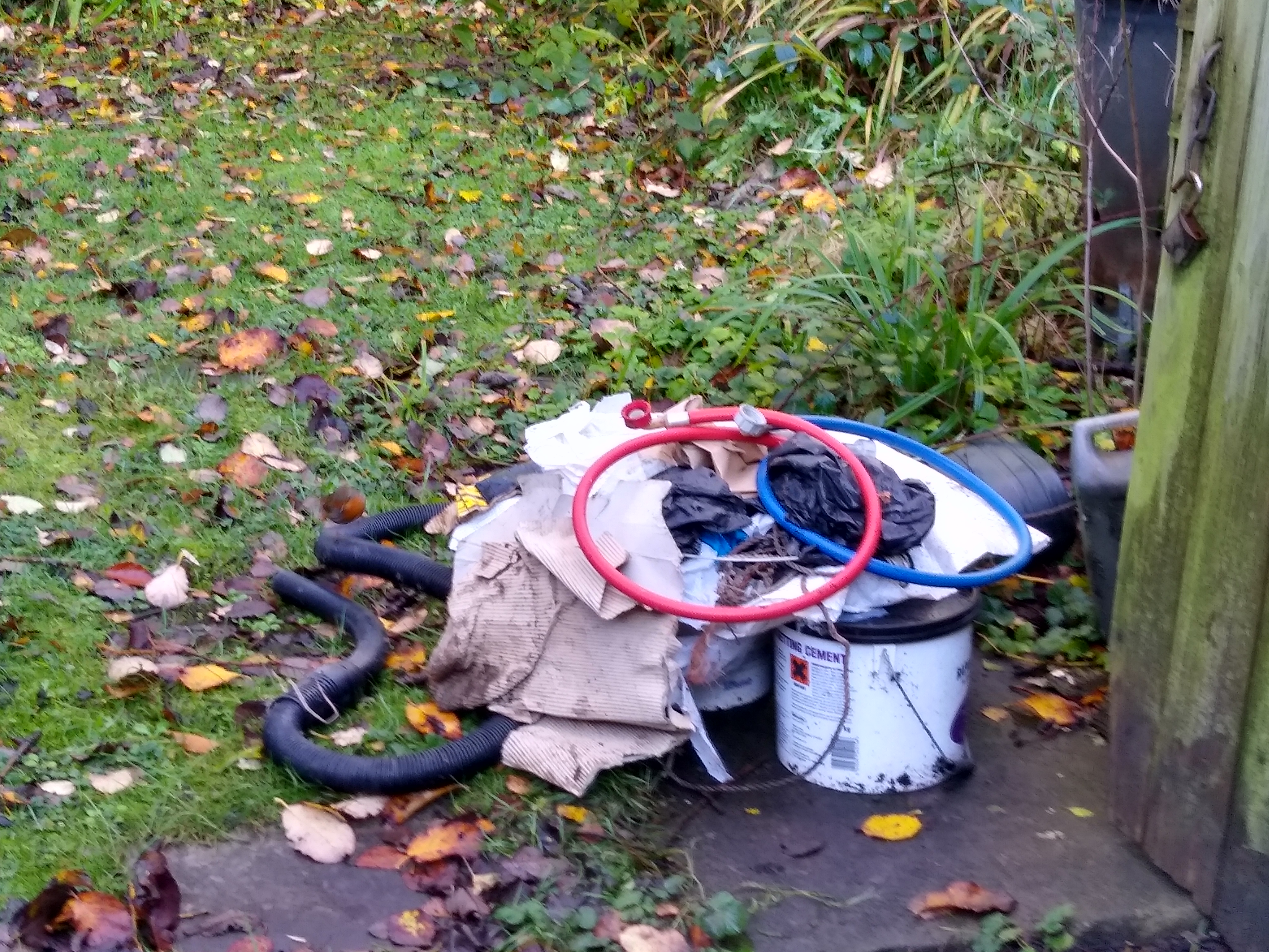
Here is a photo of the Robin in Mum and Dad’s garden that day:
He even perched on the old vacuum hose amongst this pile of shite. You can just see him – it’s a bit blurry because he disappeared when I pointed the camera at him – just as Dad would have done.
I sensed there was something in the corner of the shed that should not be disturbed, and hoped I wasn’t about to discover a dead cat or something …
The shed door doesn’t close properly, and there are gaps around the floor where the wood has rotted away. Happily, it wasn’t a dead cat but a hibernating hedgehog. If you look carefully beneath the torn yellow plastic, you can see his prickles.
This gave me the best excuse ever not to finish clearing out the shed!
Back home and making a start on Christmas shopping, I bought a gift for a friend who is very environmentally friendly, from a shop is all sustainable and ethically resourced. I paid just short of £20 for 2 pairs of ladies’ bamboo socks. (I’ve always been more of a 5 pairs for £5 girl!)
I took courage to ask the shop owner if there was a little bag I could buy, so that my friend might appreciate the value of the socks, and so that I didn’t have to chuck them in my shopping bag on top of the mushrooms I’d just bought.
Her eyes lit up. “Yes, there is!” … and she put the socks in a little bag that had been skilfully folded from old newspapers.
So, what did I do when I got home?
I put the socks in a small plastic sandwich bag, because I was worried the newsprint would rub off on the socks, meaning I would be giving my friend 2 pairs of grubby socks for Christmas. Then I put the plastic bag back into the recycled newspaper bag.
In my previous post, I shared some photos of the beautiful woodland I love to visit as often as possible. I used to go past a dog poo bin on my way up there, but it got taken away. I’m guessing that was because dog poo (in UK, if tied up in a bag) can be deposited in any public waste bin, and there are two of these less than two hundred metres away, one either side of the road.
Surprisingly, even though the bin was gone, people continued to leave poo bags around the post that the bin had been attached to. I was interested to see bags now come in colours other than black. Blue and yellow appear to be the favourites in this neighbourhood. Odd to think of choosing a colour, I mean, if you consider your favourite colour to be blue, then maybe you like to wear blue tee-shirts?
I haven’t had a dog in recent years but still have a stash of black bags. Not only are they used when Alfie occasionally visits, they are also great for protecting my phone when I’m out in the rain, or for filling up the car if the garage doesn’t supply gloves. I also mostly wear black, rather than blue or yellow, so they are an essential matching accessory 😉
Back when we had a dog, we lived in a village where the Facebook group noticeboard seemed overly dedicated to dog poo discussions. I would read the comments with wonder at the passion a fresh dog turd could ignite in people. Graphic photos as well, with speculation about the dog’s diet!
When I used to walk Gandalf, I would sometimes pick up after other people’s dogs. I figured if I was already carrying a bag or two of shite, one more wouldn’t make any difference. Then another dog walker told me I shouldn’t do that, because it was enabling the lazy ones to leave it there for someone else. I guessed she had a point, and it also wasn’t too pleasant picking up a hard cold one with no associated dog, so I stopped doing it.
This of course is different. People were taking the trouble to bag it, but then leaving the bags at the location where the poo bin used to be. Were they expecting the poo fairy to come and take it away? I knew I’d make a really good poo fairy. But if I removed it, would that make them think it was okay to dump it there? I’ve no desire to take on permanent poo-fairy duties, especially as I don’t currently have a dog.
I decided to clear it up. It was a social experiment with the feel-good factor of being the local womble. If I removed it, would they leave some more? Armed with a bin liner and disposable gloves, I picked up twenty-one bags of crap. It would have been a nice round twenty, but included one I’d seen the previous week that had been strategically placed at the edge of a track, as if to give the impression they were going to pick it up on the way home.
That was last weekend, so this morning’s trot to the beautiful woods had an added point of interest. I was expecting at least a couple of bags – probably the yellow ones with contents from a Labrador-sized dog. But no, there were none at all. Wonderful!
My conclusion is that no-one wanted to lay down the first bag. I wonder what would happen if I left one there? Would there be twenty bags by next weekend? No, I’m not going to try it!
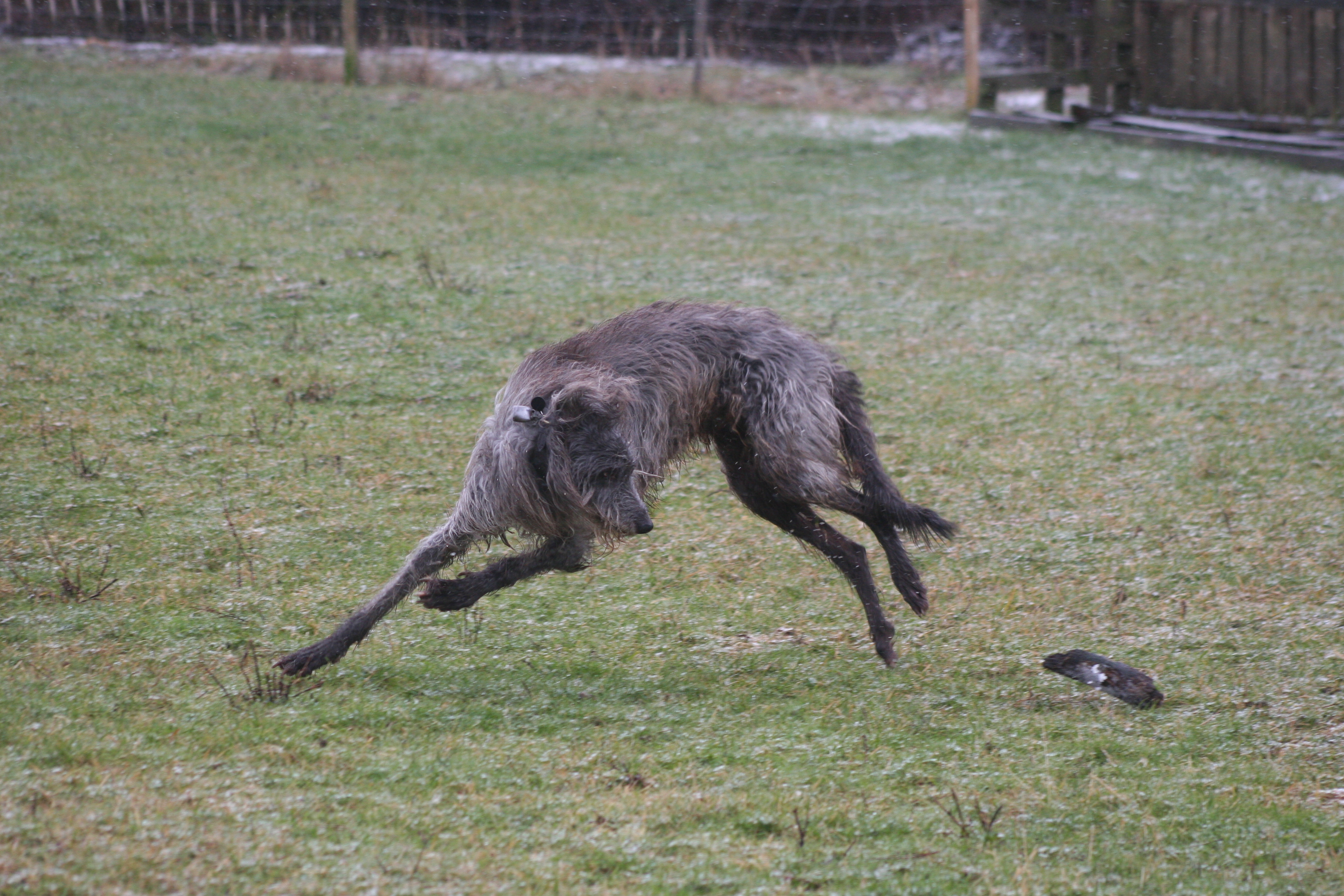
If you’ve got this far, thank you for reading crap! To end with something nice, here’s an old photo of Gandalf, playing with a lump of wood he found in a field one frosty morning:
He weighed about forty-five kilos but was so light on his feet we have a lot of photos where his feet aren’t touching the ground: