Word on a Whim

Archive for the category “Uncategorized”

Now available as a Paperback

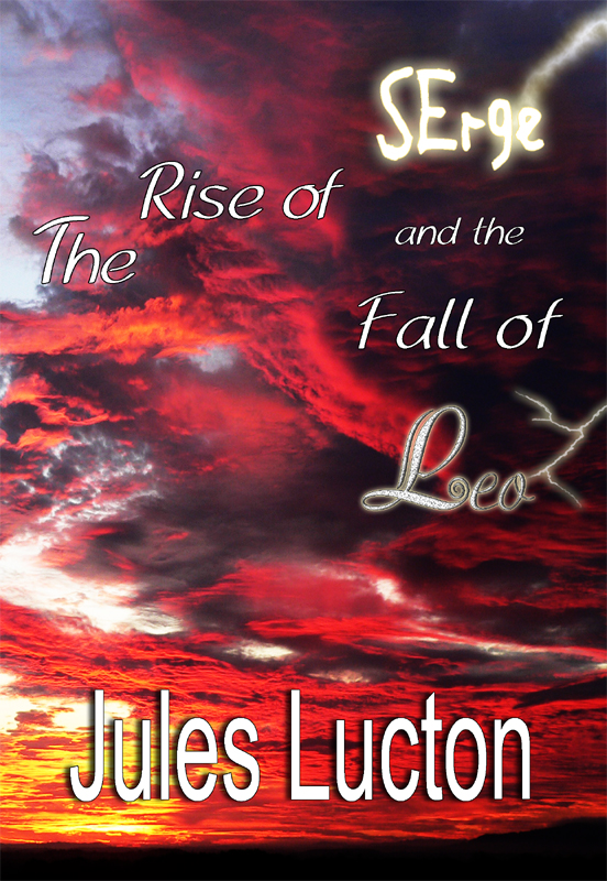
Sorry to change back the subject, but ‘The Rise of Serge and the Fall of Leo’ is now available as a Paperback (368 pages), in addition to Amazon Kindle format!

Dean’s book cover looks superb and Imprint Digital’s printing and binding is excellent.  I really hope that what’s written on the pages is of similar quality – and I hope that you will read it and let me know what you think, either by commenting on this blog or by filling in the contact form on the top of this page or by writing a review on Amazon.

To link to the Amazon Kindle version (on Amazon.co.uk) click on the book cover image.  It can also be purchased in USD from Amazon.com.

To order a copy of the paperback using PayPal -UK only please (owing to postage cost) click the ‘PayPal click here to buy’ button, beneath the cover image.

I hope you enjoy reading the story as much as I enjoyed writing it.

Thank you,

Jules

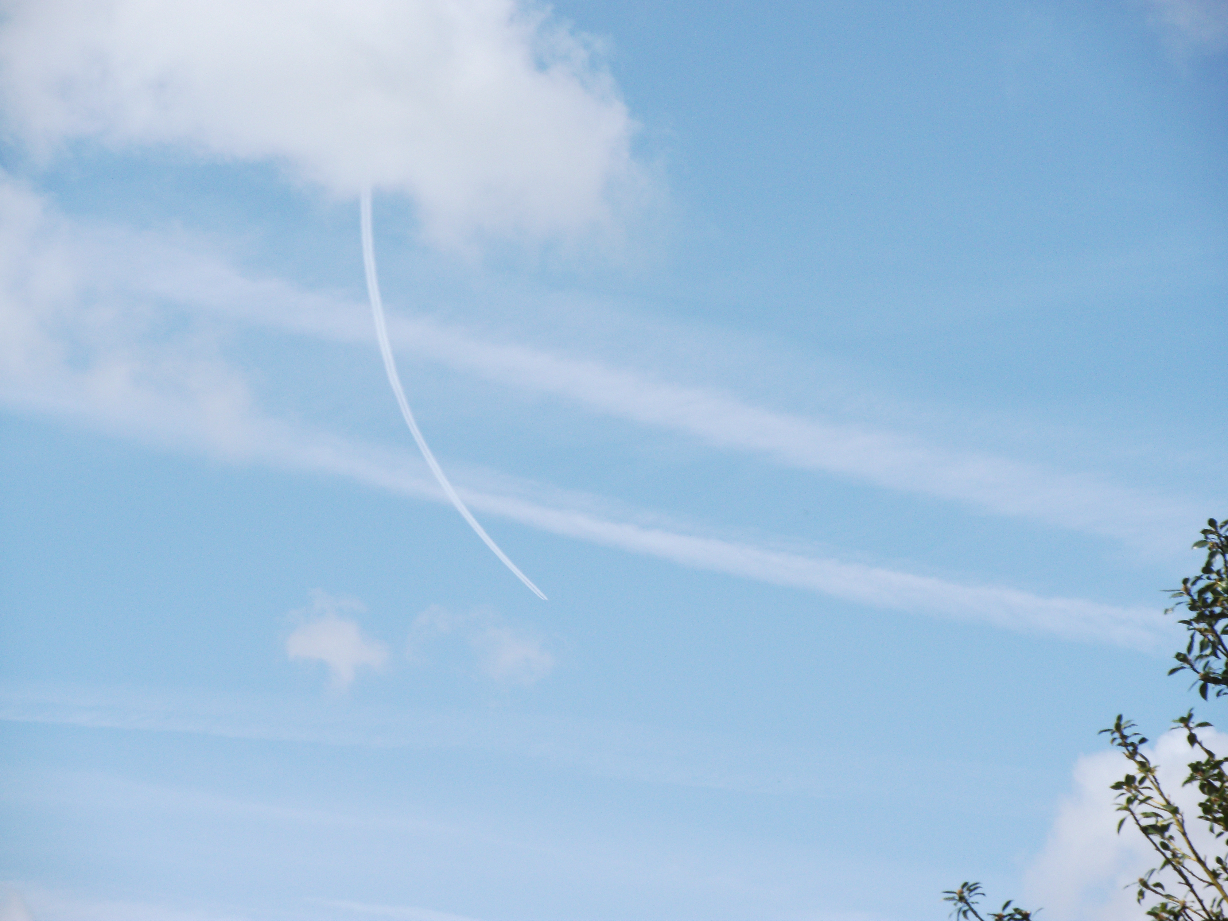
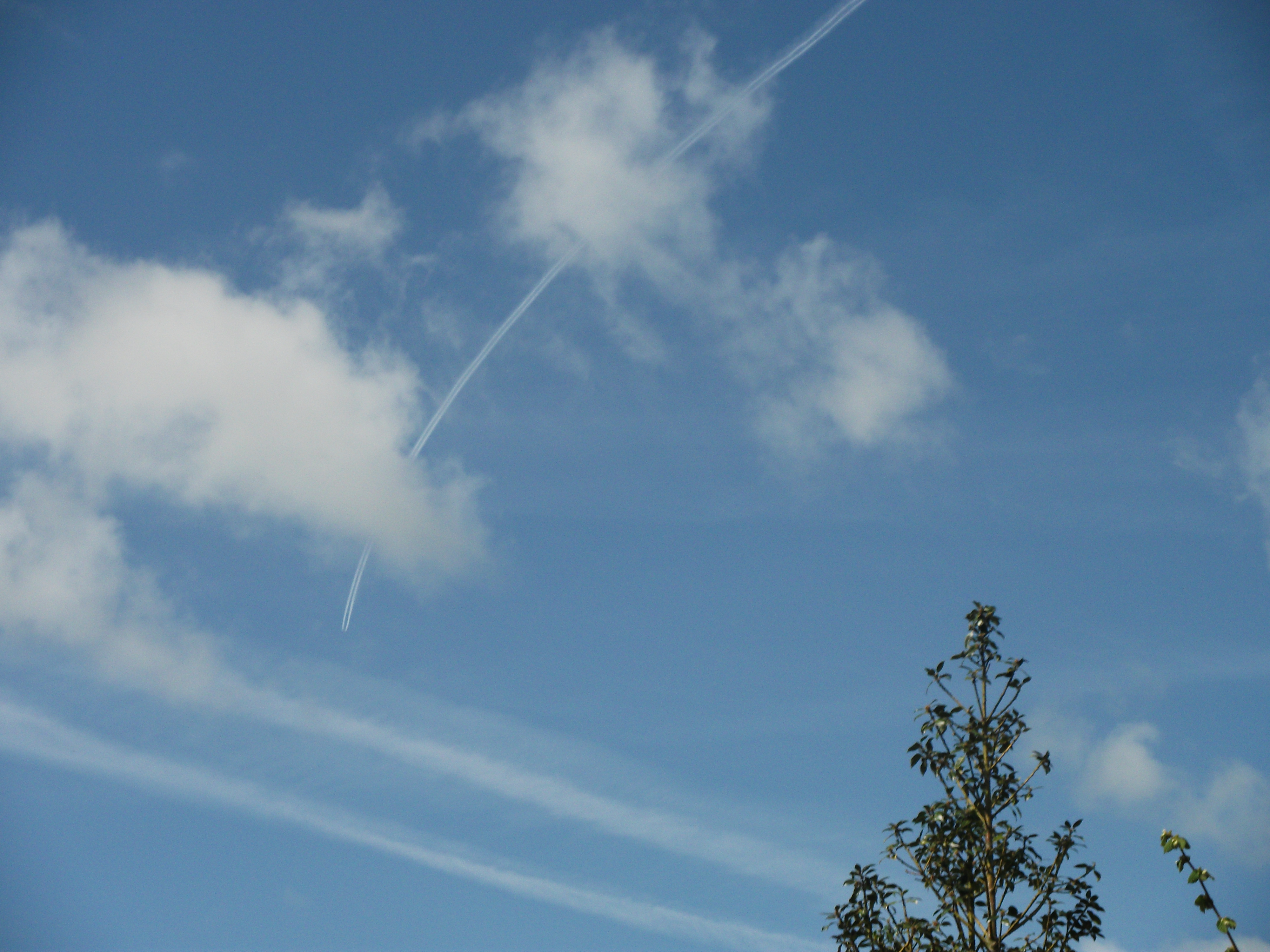
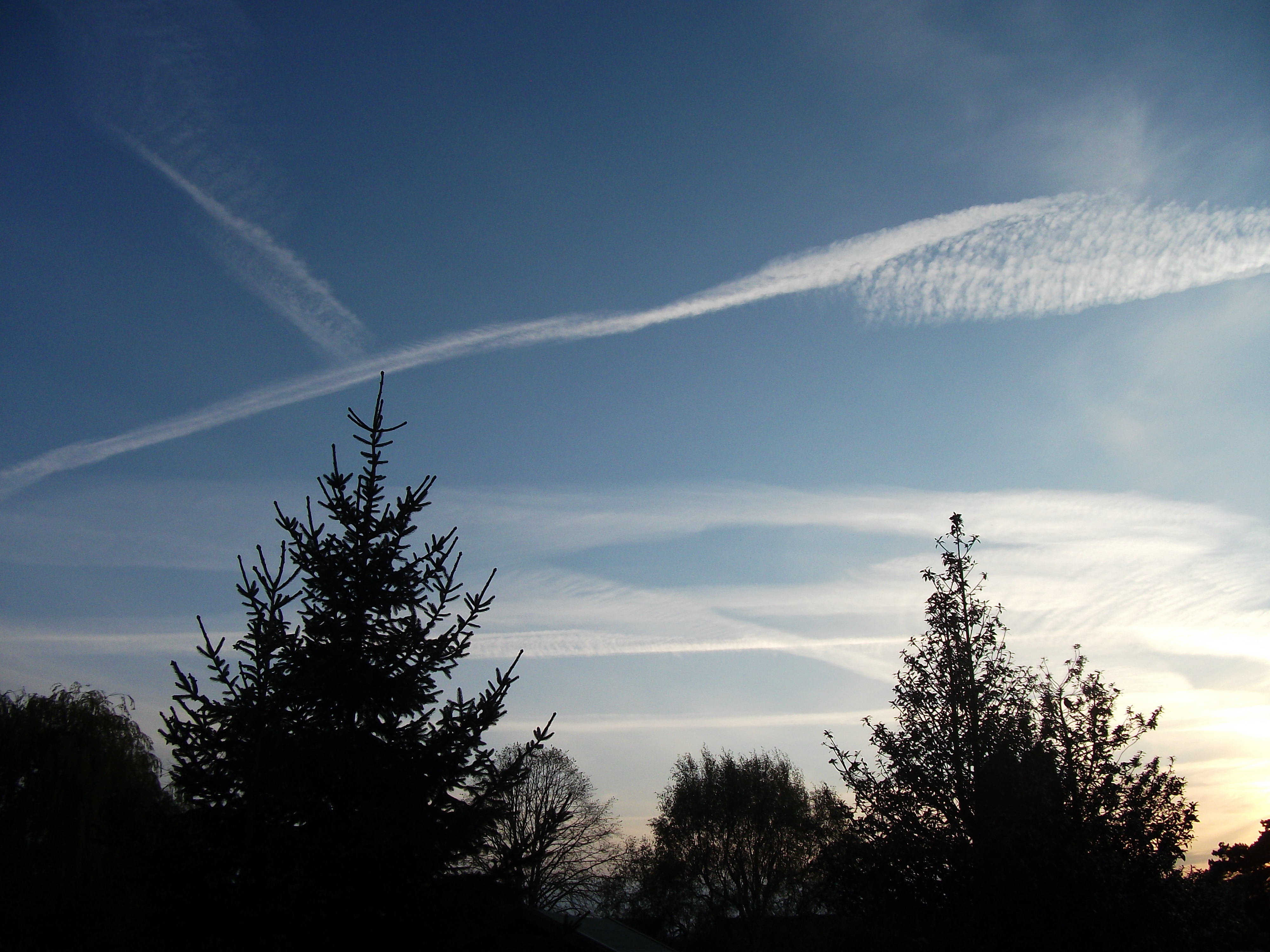
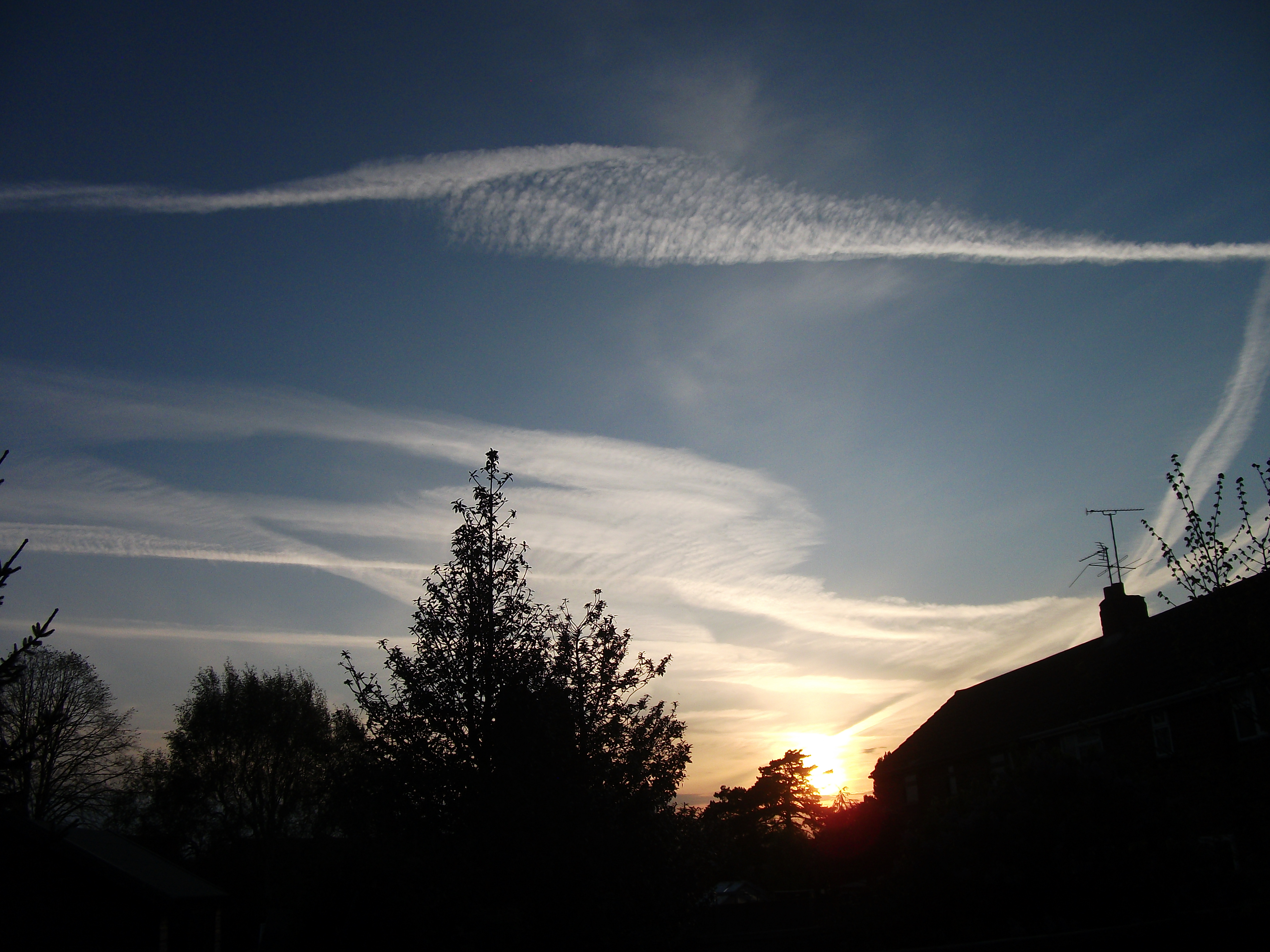
“Aeroplane Lines” What’s going on?

I live nowhere near an airport and today was the first fine day we’ve had in ages.  This morning there was an aeroplane circling around … and around … and around …

And this evening, the sky looks like this:

What’s going on?

What shall I do next?

I have finally submitted the PDF file to the printers, and the paperbacks are in the process of being printed.  Whilst I’m looking forward to receiving them I am dreading discovering a typo the minute I look inside.  Not that I ever want to read my BF book again – after all that proof-reading.

There are some books I wrote years ago that I could dig up and re-write; all of them completely different from the one I have just finished, and different from each other – or maybe I should try something new?

An issue I have with writing in my spare time is that it doesn’t leave much time for reading other people’s work, but when I decided to read something instead of jumping into a new project, I found I was still in proof-reading mode and was checking out the punctuation instead of enjoying the story.

I will be glad to get my teeth into something new!


Cover design by Dean Harkness

I have just received the finished book cover and I’m ever so pleased with it.

Thank you Dean!

Appreciating modern materials

At work but away from my usual desk, I must have done some sort of nervous tucking hair behind ears manoeuvre, which resulted in my glasses flying several metres through the air and bouncing across a concrete floor.  These were new glasses (which probably explains why they weren’t in precisely the expected place on my head!) so I was particularly pleased to find they had survived the ordeal,  although  since I’d got a buy-one-get-one-free  offer it wouldn’t have been the end of the world if they had broken.  But it did make me appreciate how much lighter and tougher and probably cheaper glasses have become over the years, and it made me think about Dave – who was my boss about twenty-five years ago, who had severe myopia.  I once tried his glasses on and apart from them weighing a tonne; it was like looking through one of those bees-eye kaleidoscopes things they sell in retro toy shops.

Dave was an unknown quantity, recruited from outside.  He didn’t say much to anyone for the first week or two, so none of us quite knew what to make of him.  He was probably just ‘finding his feet’ but I warmed to the guy the first time I heard him speak.  He had left his goldfish bowl office and was ambling between the desks of our open plan department towards the exit when his fit, young secretary called him back because there was someone important on the phone.  He rolled his eyes and said, “Fucking hell, I was just going for a crap,” and back-tracked to his office to take the call.

Anyway, about the glasses.   He had called us all into his office for a meeting.  He started by asking the lads to tone down the innuendo; the school-boy humour … but there was a wasp buzzing around and people were flapping at it.  “Just ignore it,” he said.  “If you ignore it, it will ignore you.” He went on to explain that he enjoyed a joke as much as anyone, but it was going too far when no-one could say anything without it being turned into something smutty.   Then he moved on to the next item on the agenda – except he couldn’t find his agenda – it had been misplaced.  “Where’s my secretary?  I need my secretary in here.  I need my secretary screwed to the wall …”

Our raucous hilarity must have made the wasp panic.  It did a crazy circuit of the small office we were packed in, and dived for safety behind the thick lenses of Dave’s glasses.  He reacted – like anyone would – by flinging the glasses from his face so they hit the desk and shattered.  Poor Dave, he was an ‘occasional’ contact lens wearer but had to wear them for about a fortnight with streaming red eyes until his glasses were fixed.

Thank goodness for modern materials and BOGOF’S.

Happy Easter!

Love and peace xxx

Still proof reading ‘The Rise of Serge and the Fall of Leo’

I thought I had been through it with a fine tooth comb but, randomly dipping into it, I spotted a typo that sent me back to the beginning to read the whole damn thing yet again … slowly … looking at the individual words rather than combining them into something I recognised, and yes, I am picking up one or two errors that I missed the previous time, and finding it hard to believe that I missed them.  Other people’s mistakes in prose jump straight out at me!

Yesterday I found one of my characters stoking a dog instead of stroking it.  Oops!  I can’t blame the spell-checker for that one – but I do get cross with it for arguing with me all the time about apostrophe use, to the extent that I begin to doubt myself.  In the book I have frequently used it’s as an abbreviation for it is and the spell-checker keeps trying to persuade me to remove the apostrophe.  That is just one example of the spell-checker being annoying, which prompts me to be a bit too click-happy on the Ignore button, so I end up skipping some of its valid corrections.  See, I do know how to use the apostrophe!   I also know this story so well by now that I have no idea whether it’s any good or not.  I believed it was good when I had just finished writing it, but I am too close to it now to judge it – it has turned into a grammar and spelling challenge.

I only hope that when it is eventually published, people will read it and tell me honestly what they think.

My duff cover design

Duff cover design

I thought I’d exhibit this here, since it will never be used.  If it makes anyone laugh then the time it took me to create it hasn’t been wasted!  I know it looks uninspired, but I probably would have used it if the print on the back had been okay.  The flask and champagne glass are supposed to represent Serge and Leo.  Serge has an attachment to thermos flasks and keeps one with him at all times, and Leo has had a life of celebrated success until his world falls apart.  A shattered champagne glass would have been more appropriate but I was not prepared to break the glass for the sake of my art. Well, I did consider it, but was worried about the dog’s paws – and it would probably have broken all wrong; either shattering beyond recognition or just snapping off at the stem.  I expect anyone who knew what they were doing with Photoshop would have used separate images of the flask and champagne glass and overlaid the glass over the flask at a more dramatic angle.  I simply put a coaster under the edge of the glass to tilt it as far as possible without it falling over!

I emailed the jpeg file to my chosen printing firm, Imprint Digital, asking is they could print it off on paper to see if the small print looked readable and they were good enough to print in on card and post it to me the same day.  I was most impressed with the quick and helpful response from Imprint Digital, but it confirmed the doubts I had about the quality of my file, as the writing was still blurry and pixelated despite the high-spec printer.  I was no longer able to blame my tools. Now I am glad that the print is blurred, otherwise I would have made do with it, and it’s really not very good, is it?

Loving my characters

‘The Rise of Serge and the Fall of Leo’ took me a long time to write, and I gradually grew to love Serge and Leo as if they were family. I would plan future chapters of the story whilst awake at night, or washing up, or stuck in traffic, and I missed them when the book was finished and they were no longer part of my daily life. The project had been shelved for months when real life events took over; resulting in some continuity issues which had to be resolved. And then, when it was all over, I wrote the synopsis!

The final proof reading is still ongoing but I’m finding I want to change things, which is annoying, as it introduces more scope for errors and I don’t want to have to go through it all again.  Particularly in the early chapters, I keep thinking Serge wouldn’t react like that, or that’s not a word that Leo would use.  I guess it’s because their personalities have developed and characteristics reinforced over the course of time, and I now know exactly what they would say or do in any situation.  Only they’re not with me any more …

Who judges a book by its cover?

A short time spent researching the subject suggests that people do judge books by their covers – but the majority of these were selling their book cover design services.

Having access to a PC with Photoshop CS3 installed, I decided to try saving a few bob by making my own book cover.  I had never used Photoshop and mistakenly thought that when I opened the package it would be obvious what I was supposed to do with it.  It wasn’t.  Not to me, anyway. Fortunately, people have taken the trouble to put helpful tutorials on the internet, and after chipping away at my project over the last few weeks, I have a book cover that looks okayish on the screen.  But it has taken me far longer than I expected and has eaten into my precious writing time.  And I couldn’t reproduce it – I have no idea really how I got it to this stage.

There are in fact two covers, one for the Kindle version, which is just the front cover, and one for the paperback, which from left to right, has the back cover with the ‘blurb’, followed by the spine, followed by the front cover.

I decided to print a copy of the paperback version, and now I have a dilemma.  The small print on the back cover, which looks fine when viewed on the screen, is quite blurry on the paper.  I googled and found that other people had the same issue, and took advice on using the sharpening tools and so on, but it still looks rubbish on paper.

Could it simply be that our little inkjet printer isn’t up to the job, or is this how the cover will look when the books are delivered from the printers? Perhaps I could email my image to a printing firm and get them to print a copy on a decent printer. If this is as good as it gets my book will have a very ‘home made’ look. I would expect anyone to judge the book negatively by this cover.  I do hope I haven’t wasted my time.

Post Navigation